Role: Lead UX/UI Designer
Scope: Full UX/UI redesign
Evalart is a candidate assessment platform used by companies across Latin America. It helps recruiters and HR professionals evaluate candidates through technical, behavioural, and cognitive assessments.
Context & Challenges
Following Evalart’s acquisition, I was brought in as the sole designer to lead a full UX/UI redesign. The platform, while feature-rich, had become cluttered and unintuitive - overwhelming users and generating a high volume of customer support inquiries.
My goal was to simplify the user experience, modernise the interface, and increase overall usability and adoption - taking into attention already existed platform’s powerful functionality.
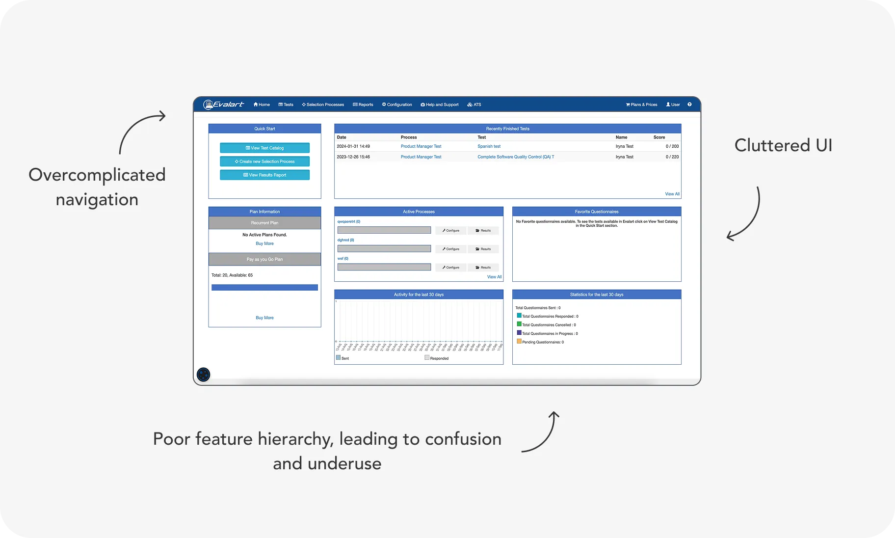
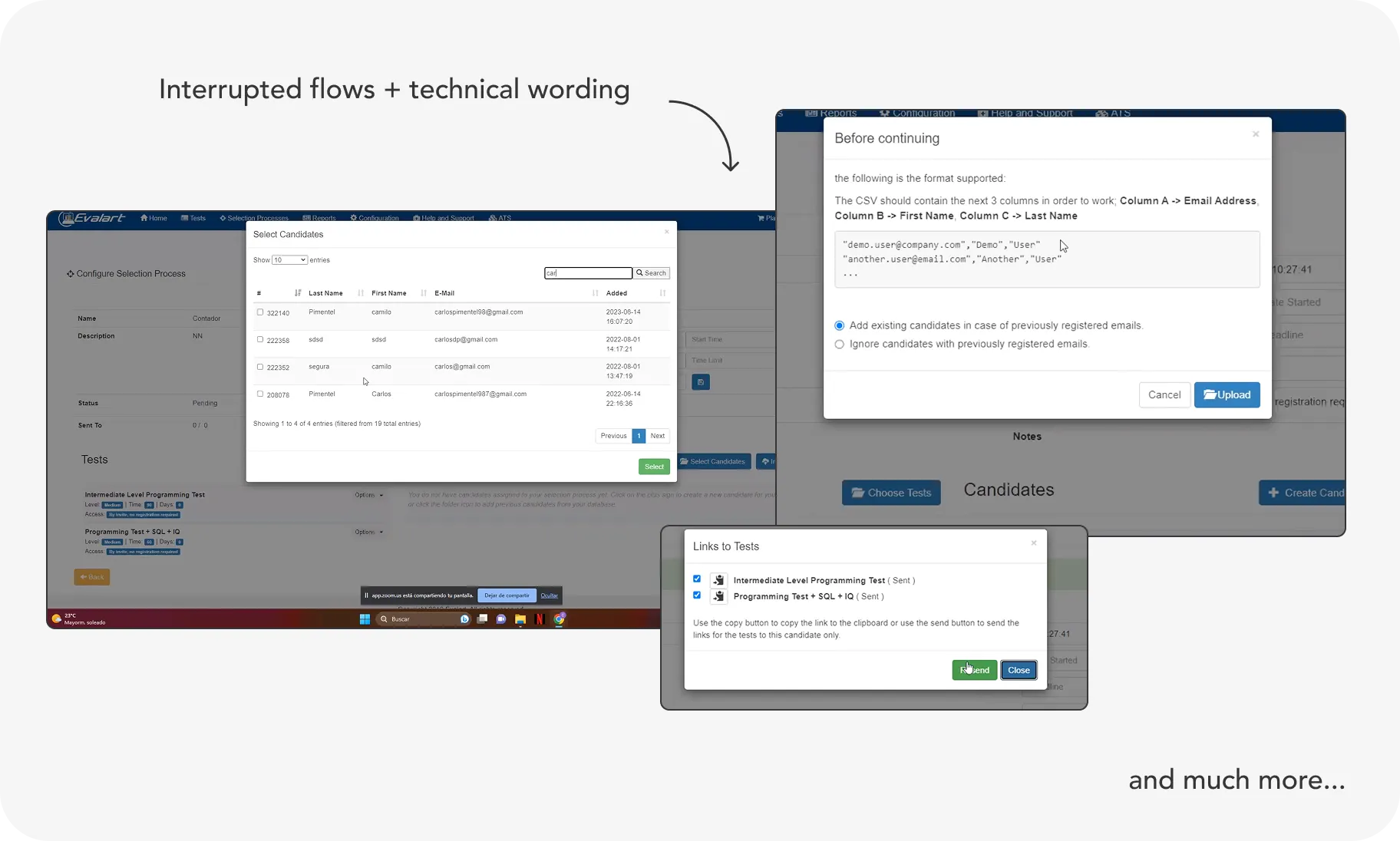
Key issues included:
Design Process
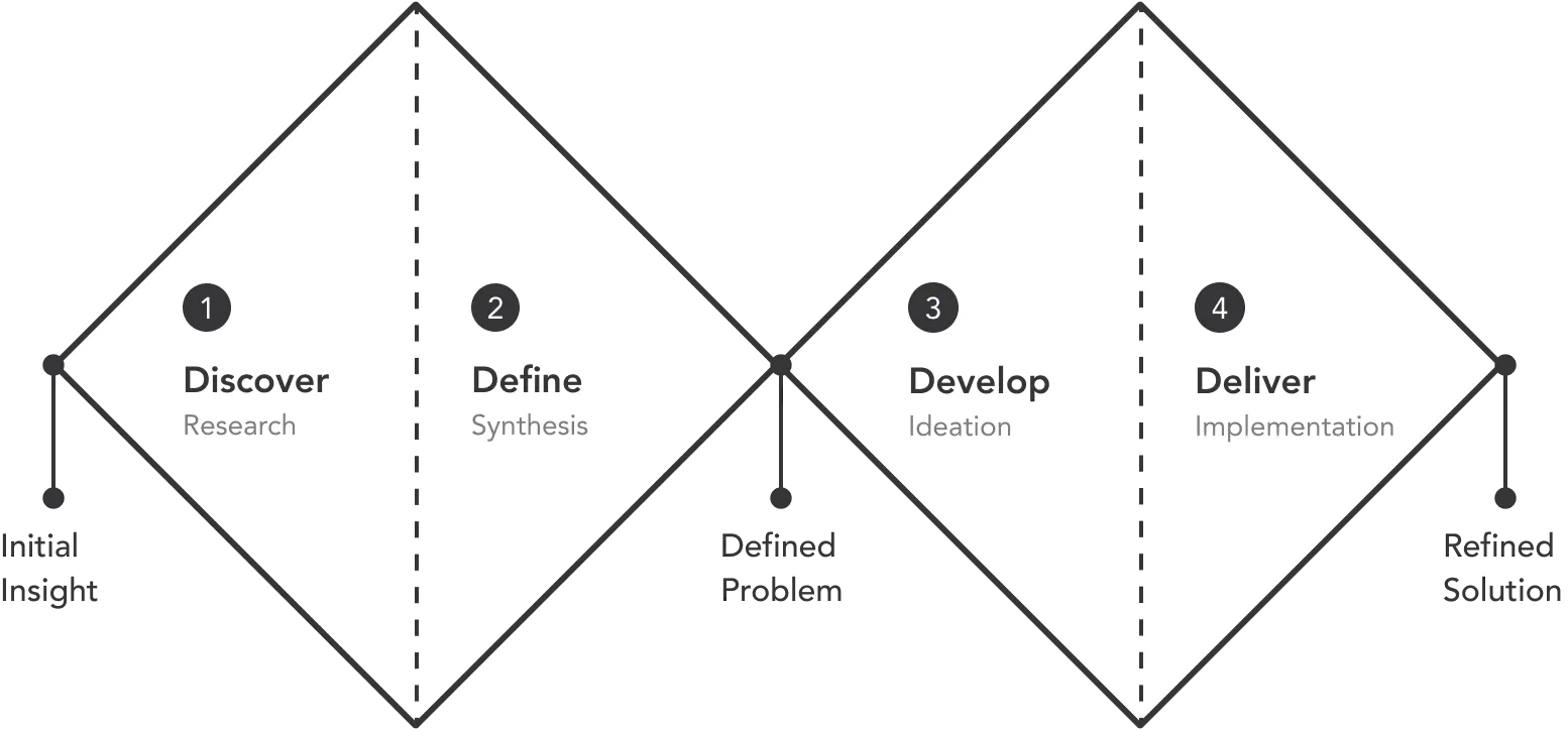
I used a Double Diamond design approach, working closely with stakeholders and real users to untangle the platform’s complexity and drive clarity at every stage.
During the process, team realised we were dealing with major technical debt, which created significant limitations and forced us to make many design compromises.
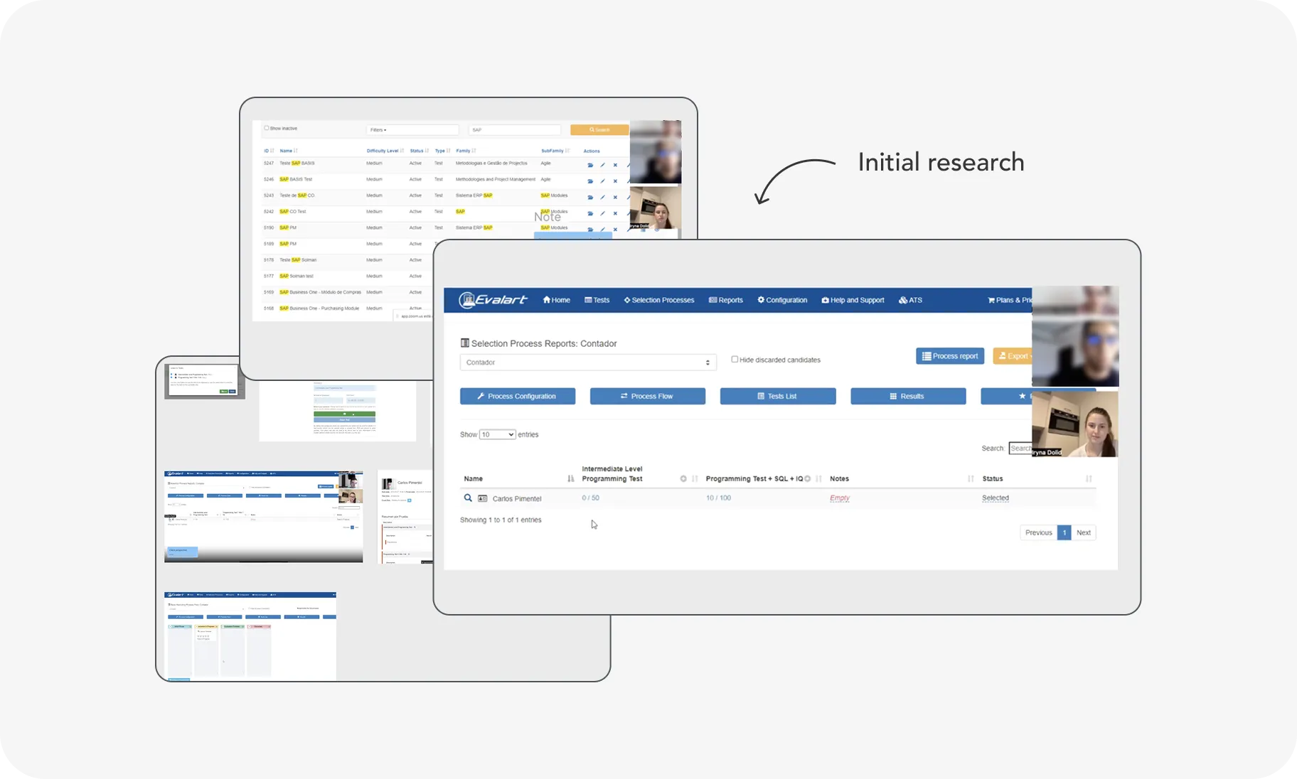
Platform Deep Dive
We collaborated with the product manager and customer support lead (from the original Evalart team) to map out the platform’s existing structure and functionality. Early sessions highlighted major pain points and sparked key ideas for simplification.
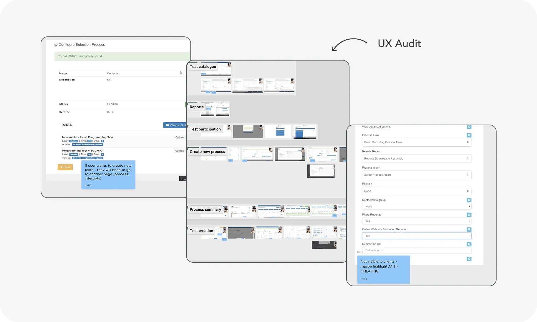
UX Audit
I also conducted an in-depth UX audit to identify surface-level usability issues - such as inconsistent menus, dead-end flows, and redundant steps.
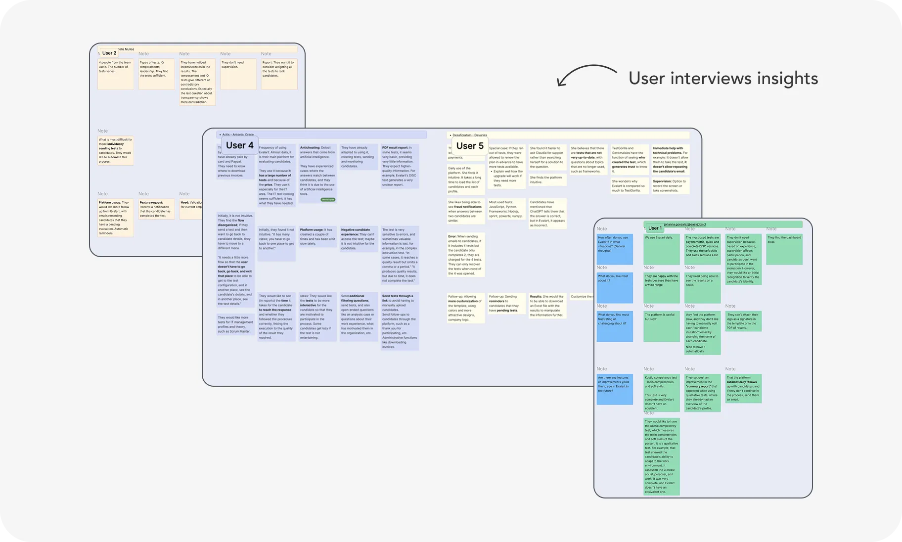
User Interviews
Interviews with 12 recruiters from various LATAM countries helped to understand real-world workflows, tool usage, and major frustrations.
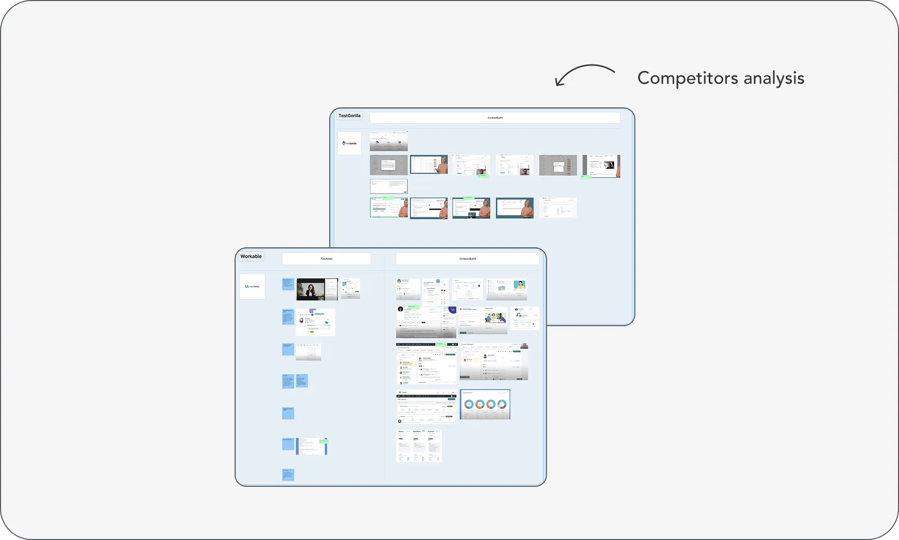
Competitor Analysis
I analyzed leading assessment tools to identify patterns for improved navigation, user flows, and test visibility.
Key insight
Simplifying core workflows and surfacing underused features (e.g., test creation) could significantly reduce support volume and increase user satisfaction.
Ideation & Strategy
I held ideation sessions with the product manager to define UX hypotheses and prioritise long-term structural changes.
As a result a clear design goal was defined: Make key actions (assessment & test creation, candidate’s invitations, progress tracking) intuitive and accessible reducing the interruptions in the flows. Improve navigation and platform structure to create smooth experience.
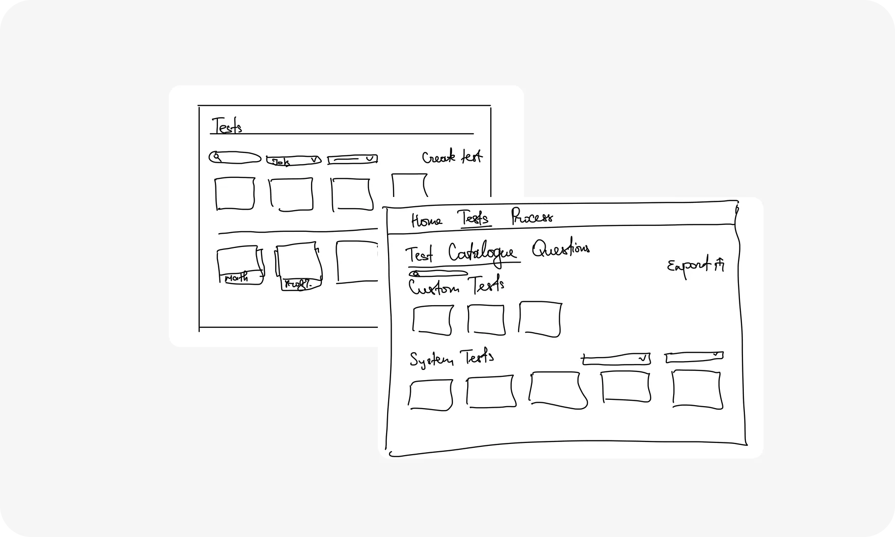
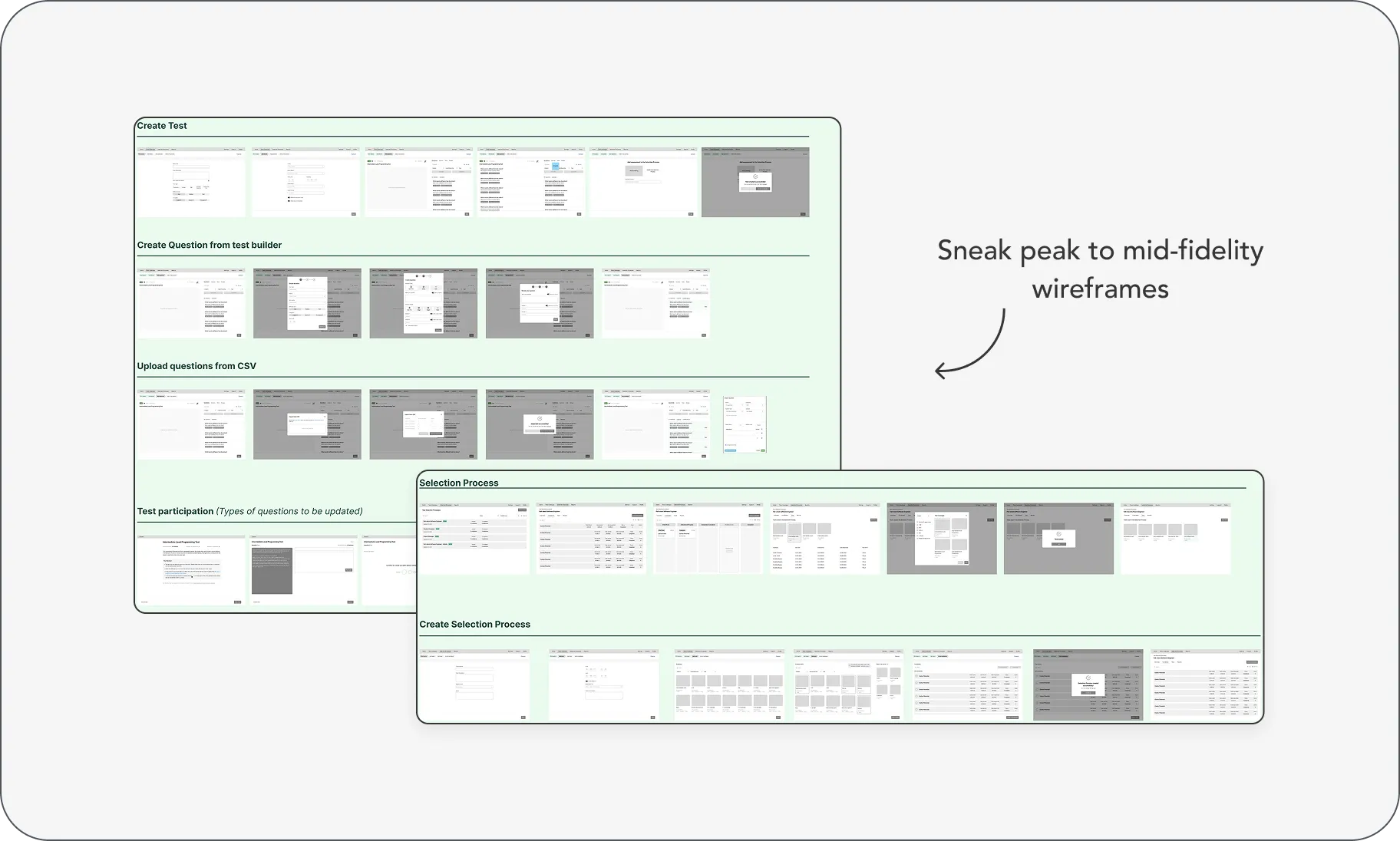
Wireframing
I started by sketching and proceed to middle-fidelity wireframes to reimagine the platform’s structure and key userflows.
Then validated wireframes through 3 rounds of usability testing with 8 users, refining flows to reduce clicks and confusion.
UI Design
After wireframes were tested & iterated, I designed a clean, modern interface by balancing functionality with visual clarity, guiding users through a smoother, more intuitive journey. To ensure consistency and scalability, I also developed a robust design system covering components, layout patterns, and interaction states.
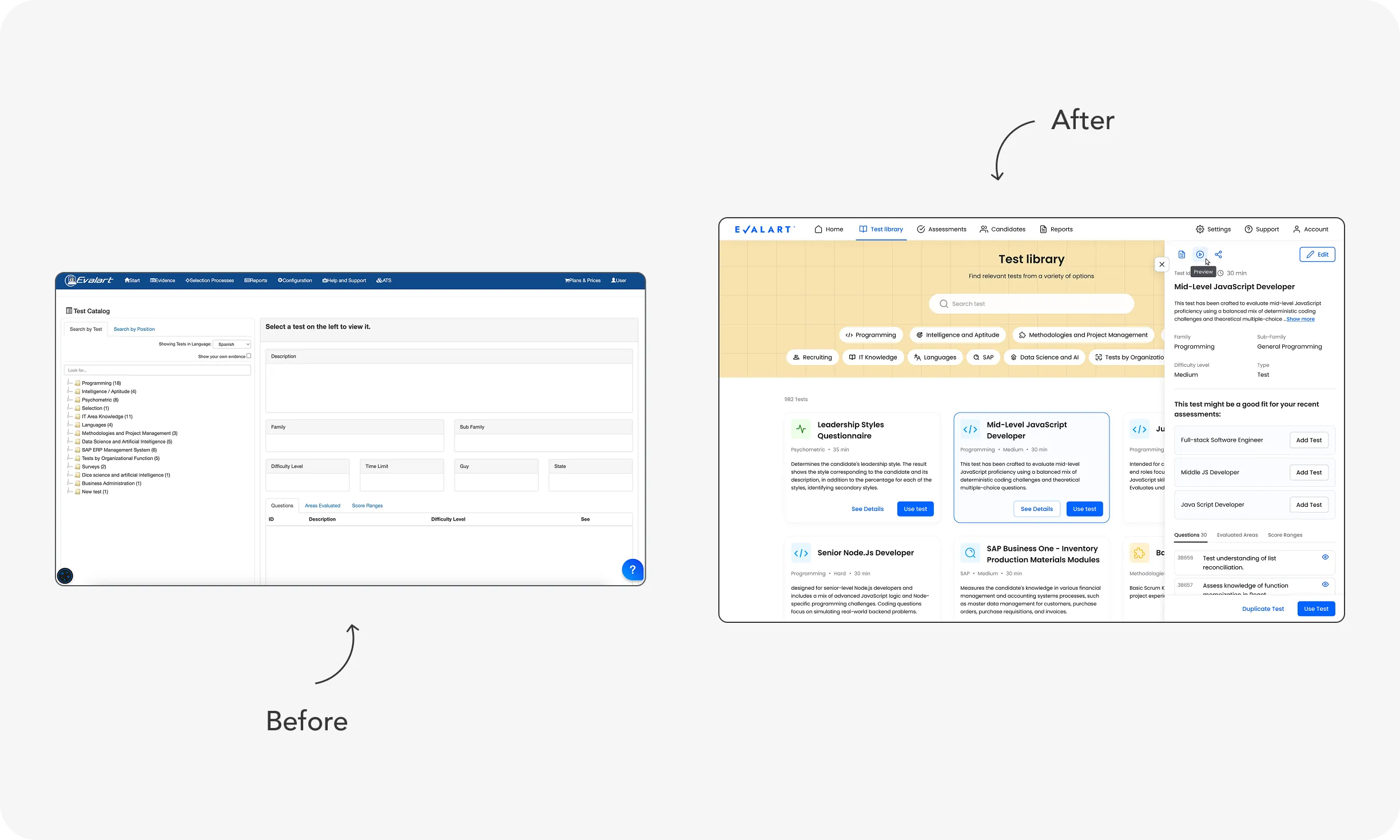
To illustrate the transformation, I created visual comparisons of key screens:
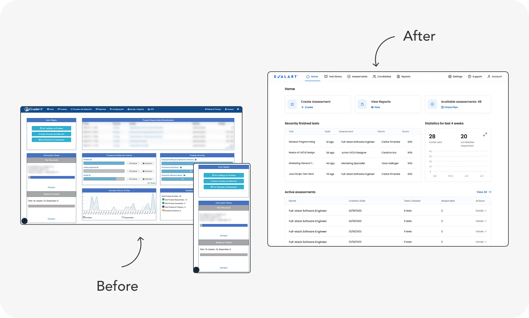
Navigation Overhaul
From multi-level, confusing sidebars to a clean, centralised navigation that reflects user workflows.
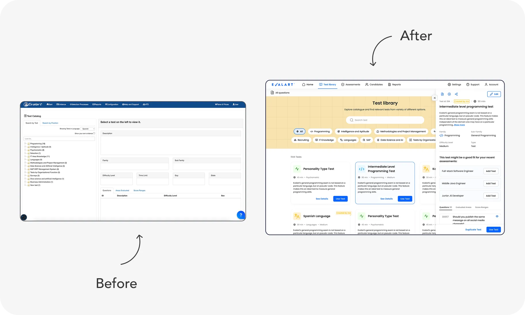
Test Catalog Redesign
We explored multiple design concepts based on the initial hypothesis that technical users - who primarily select tests - would find a folder-based layout (familiar from code editors) more efficient.
However, through usability testing and several design iterations, we uncovered significant friction for non-technical roles who also needed to navigate the test library.
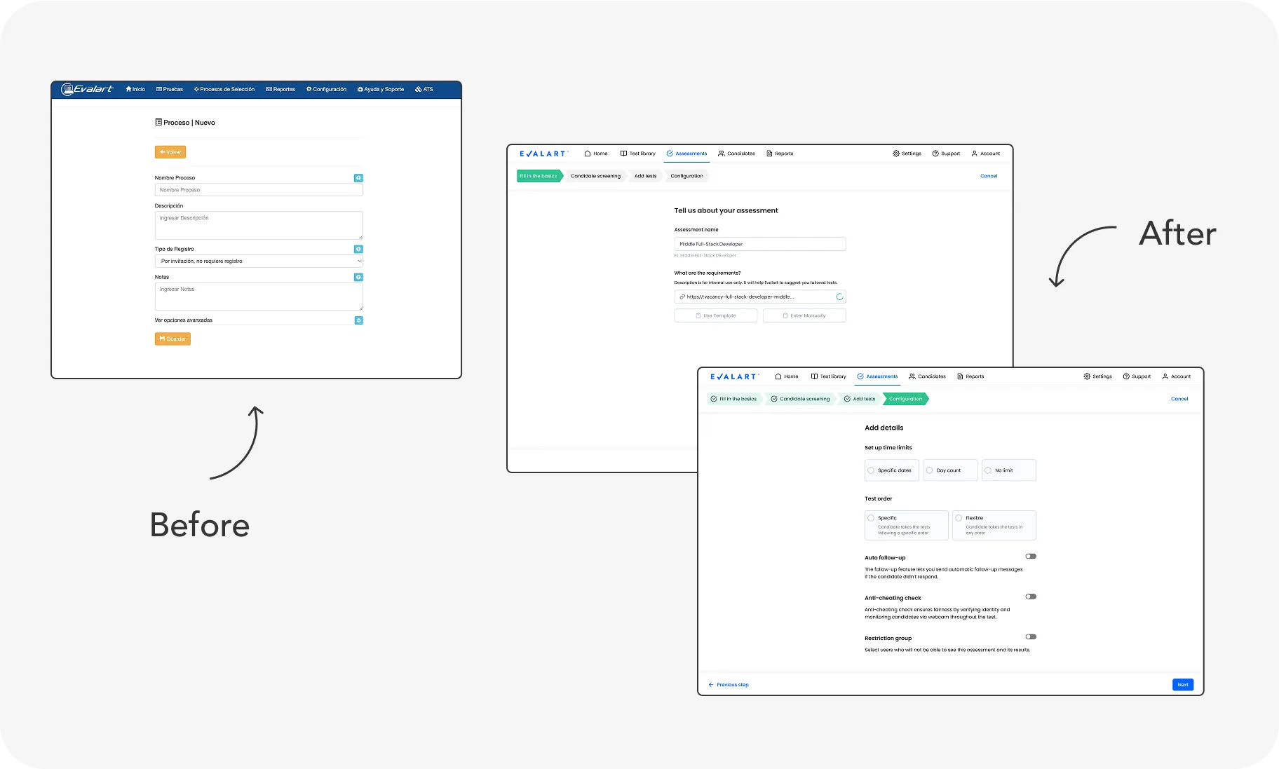
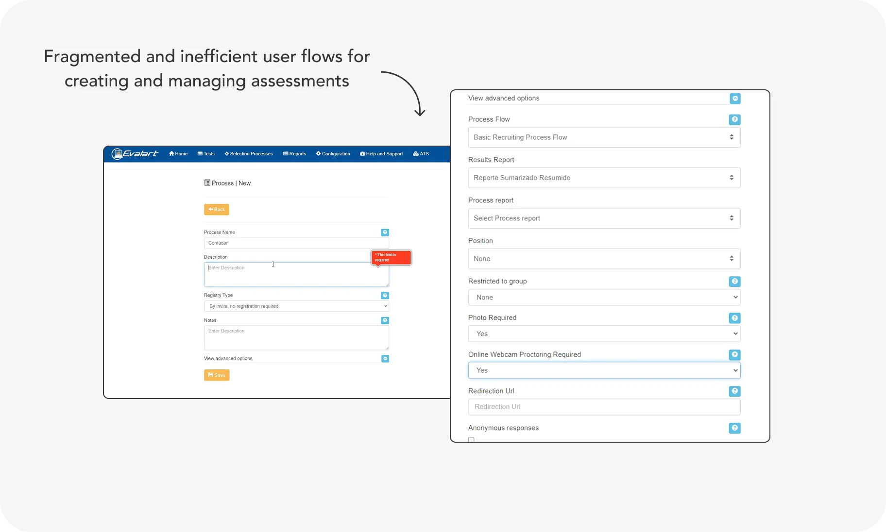
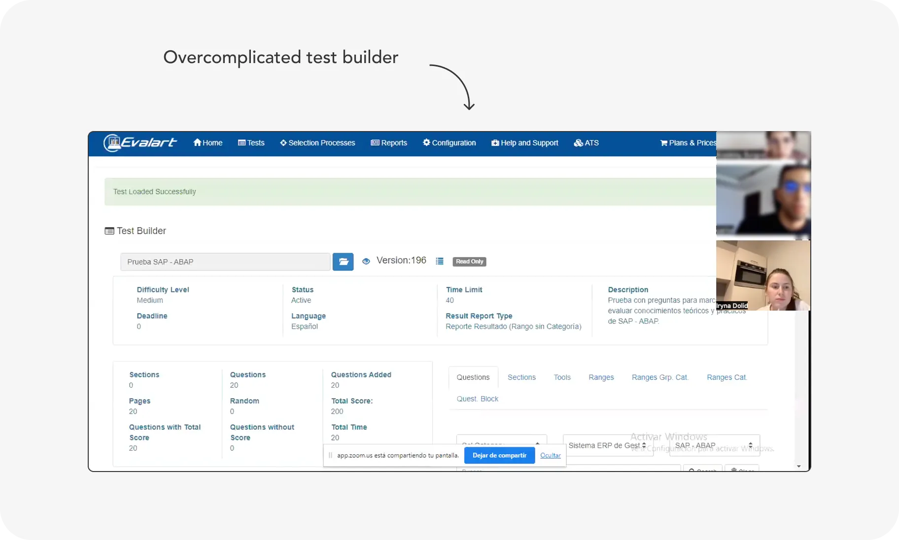
Assessments Creation Process Simplified
One of the main pain points for Evalart users was the complexity and fragmentation of the assessment creation process - it felt interruptive and unclear. My goal was to streamline the flow and reduce the time needed to complete the task.
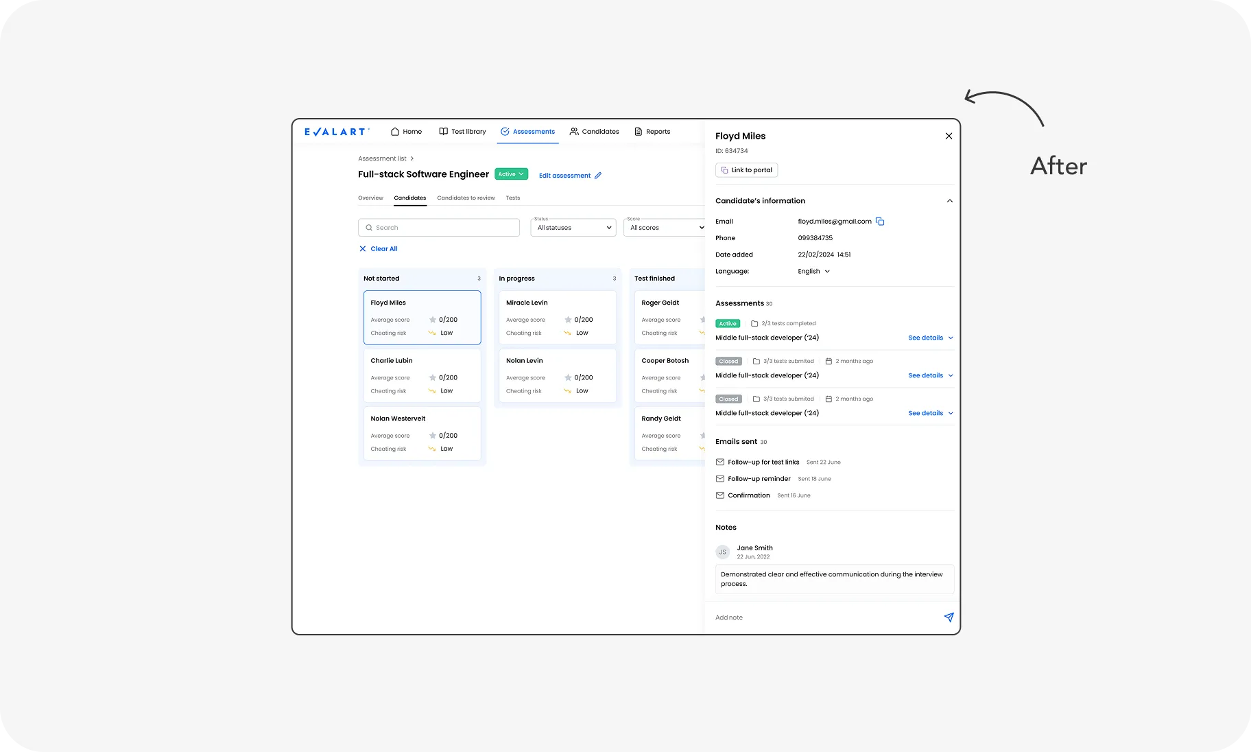
Candidate Progress Tracking Optimized
The new layout breaks down the hiring stages into clear steps, with visual indicators and contextual actions that help hiring managers and recruiters instantly understand where each candidate stands.
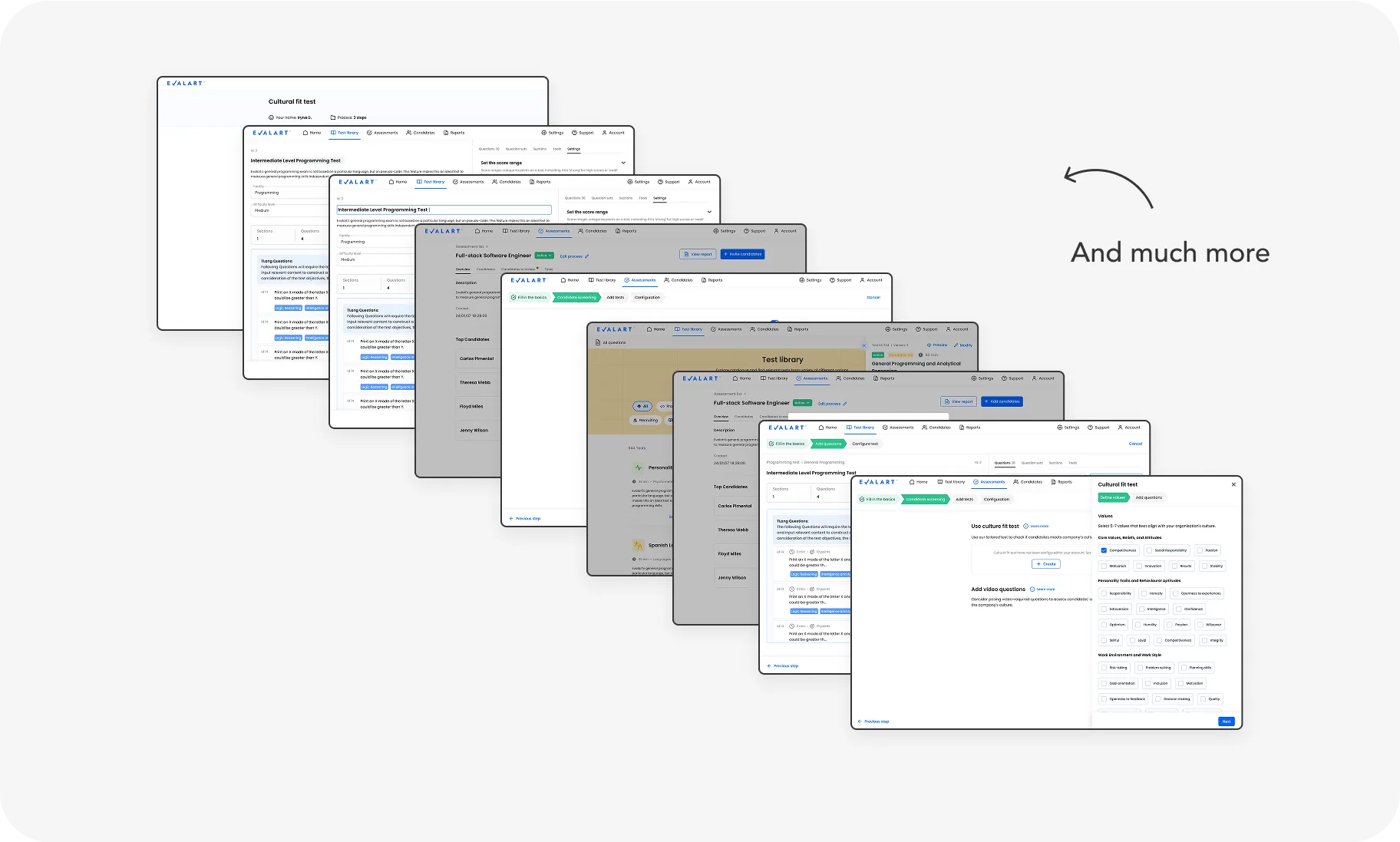
And much more improvents
Curious to learn more or see the full scope of work? Let’s schedule a call.
Impact
While formal metrics are still being gathered, early feedback from the team indicates a substantial improvement in efficiency.
Reduced Completion Time
Assessment creation time dropped from 30 minutes to 5 minutes thanks to simplified workflows, clearer hierarchy, and contextual guidance.
Enhanced User Satisfaction
Early feedback highlights how contextual guidance and streamlined flows boost confidence and ease of use.
Reflections
This project taught me the power of iterative design and deep user empathy. Managing a large-scale redesign solo & balancing user needs with technical constraints honed my ability to prioritise, communicate, and adapt under pressure.
Additionally, working on a product in Spanish - a language I don't speak - challenged me to collaborate even more closely with stakeholders and rely on strong UX fundamentals to ensure clarity and usability across language barriers.