Plan limits used to appear as an error after the work. I redesigned Sendtric so they appear as a choice before it.
- Role
- Sole designer, with an AI agent
- Timeline
- Oct – Nov 2026
- Industry
- Email marketing · B2B SaaS
- Status
- Released
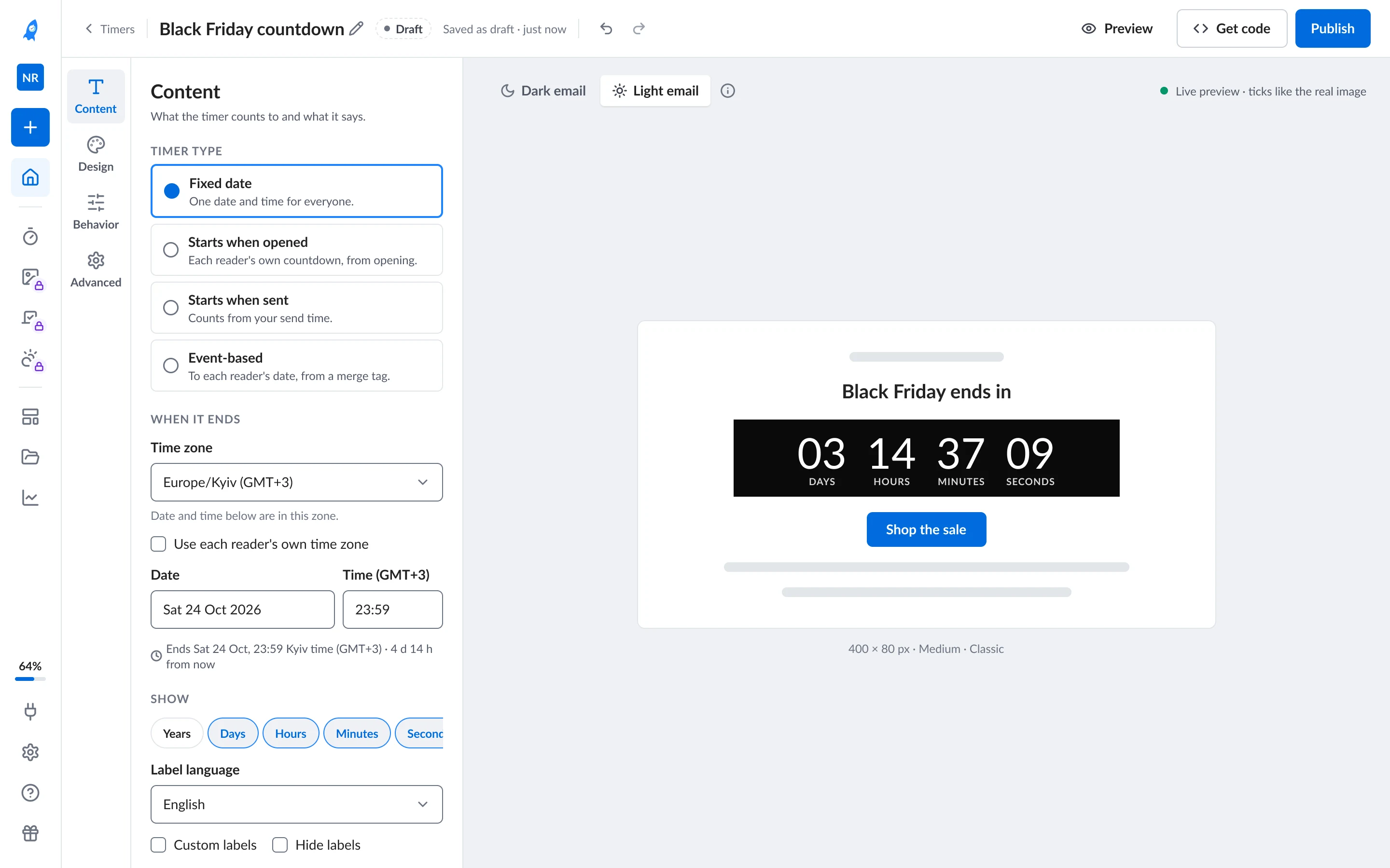
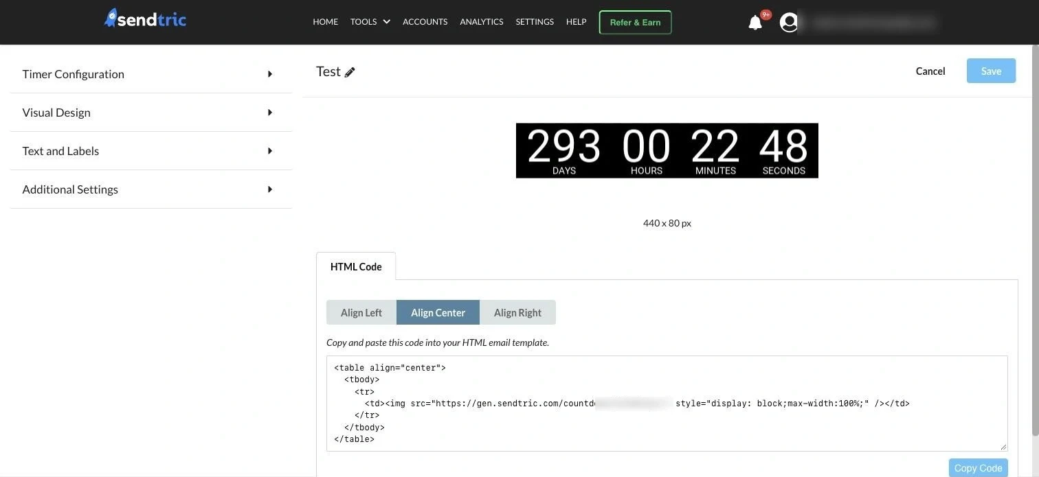
Not one problem but five.
Each was raised by a different person. Nobody had looked at the whole product at once.
-
01 Navigation
~90%
of tool use is Timers, behind the same menu as the rest
-
02 Dashboard
Most
visits passed straight through to the Timers list
-
03 Lists
1–5
timers per person, archived one by one
-
04 Editors
5 layouts
for 8 editors; the time picker was the #1 rage-click control
-
05 Upgrade limits
4 in 10
paid timer picks ended in an error at Create
The audit found 4 more
- 29%
- Did it work?
- 5
- Plan gates
- ~2:1
- Contrast
- Raw
- Errors
The product grew one feature at a time, so I didn’t patch each screen on its own. I designed one system: widget states, one plan gate, one editor shell.
28 days on one calendar.
I split the work into phases myself, in the order the evidence picked. After the first product-owner review the scope widened to a full redesign, so I re-planned the rest into seven phases, each ending with a review stop.
The 28 days in words
A 28-day calendar, 15 October to 11 November 2026, showing seven milestones, the first plan, the seven re-planned phases, three handoffs and the build week that ended in release.
- Milestone 1, 15 October: Audit + 21 queries.
- Milestone 2, 22 October: PO review · scope widened.
- Milestone 3, 27 October: New pricing in a day.
- Milestone 4, 2 November: 17 of 18 comments applied.
- Milestone 5, 3 November: Design review.
- Milestone 6, 4 November: Code prototypes.
- Milestone 7, 9 November: Pricing postponed.
- My first plan — Audit, 15 October.
- My first plan — Foundations → nav → editor + upgrade → lists, 16 October to 21 October (3 internal checkpoints).
- Re-planned after review — P1 Quick wins, 23 October to 24 October.
- Re-planned after review — P3 Core, 25 October.
- Re-planned after review — P5 · Editors in detail: variants + code prototypes, 26 October to 4 November.
- Re-planned after review — P7 · Quality · next, 5 November to 9 November.
- Re-planned after review — P2 Foundations, 23 October to 24 October.
- Re-planned after review — P4 New areas, 25 October to 26 October.
- Re-planned after review — Unnamed, 27 October (new pricing absorbed in a day).
- Re-planned after review — P6 · Dashboard to the PO’s structure, 3 November to 9 November.
- Handoff H0, 24 October.
- Handoff H1a, 25 October.
- Handoff H1, 30 October.
- Build — Product owner builds it with AI, 2 November to 8 November.
- Released 11 November.
Five decisions, one for each problem
01 Solves 05 · Upgrade limits
Let people try paid features. Gate only publishing.
Problem
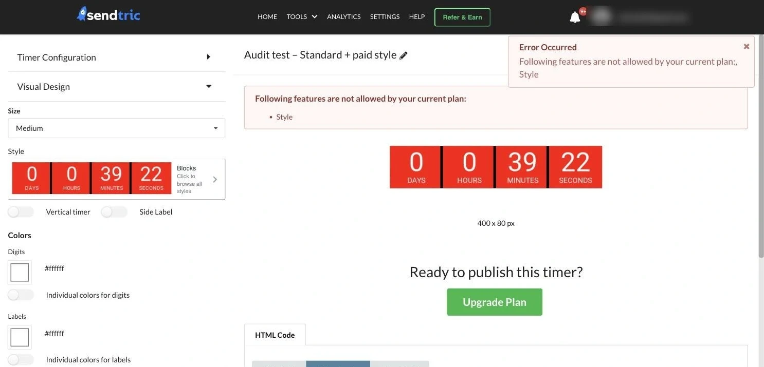
Free users picked paid styles without seeing they were paid, customised for ~5 minutes, then hit an error at Create that named no plan and no price. 4 in 10 paid picks ended there.
Decision
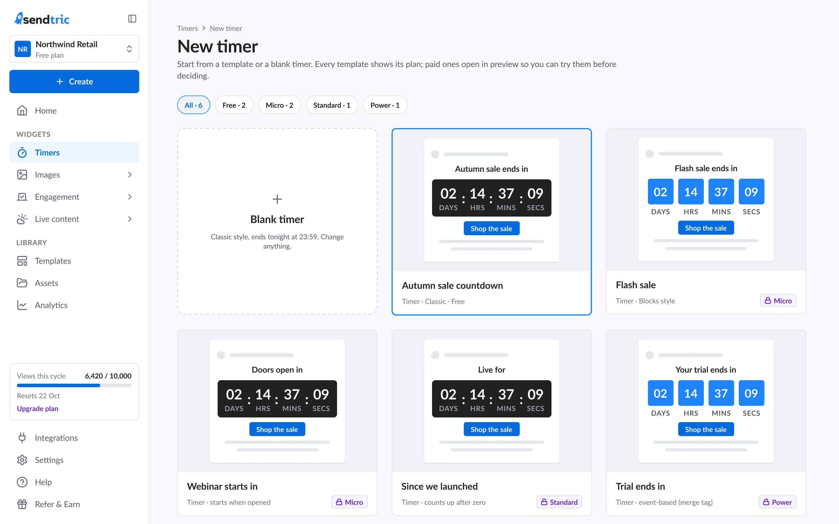
Show the plan on every option, let paid styles preview live, and gate only Publish, with one sheet that names the feature, the plan and the price.
Why People explore paid options. A lock before use stops them right when they’re convinced, and the moment they see the result is the best moment to ask.
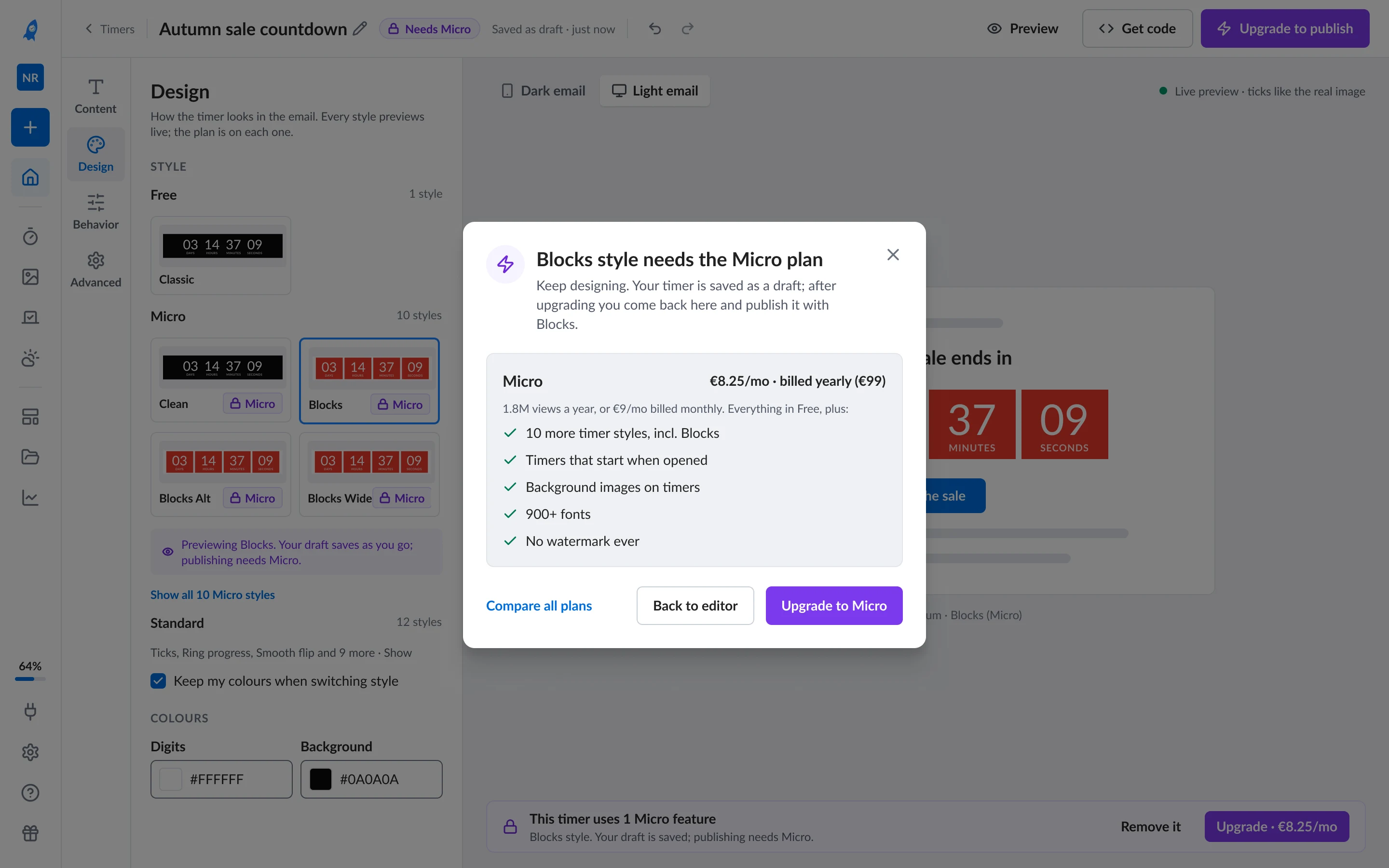
- 1 Plan on every option, before you pick it
- 2 One sheet at Publish, feature, plan, price
- 3 A quiet bar, Remove it, or Upgrade
02 Solves 04 · Editors
One editor shell for eight editors.
Problem
Eight editors used five different layouts, so the same action lived in a different place in each. The time picker was the #1 rage-click control in the app.
Decision
One shell for every tool: one top bar, the same four groups in the same order, a live preview in an email, and typed time with the time zone first.
Why Learn one editor and you know all eight, and new tools plug into the shell without a redesign.
- 1 One top bar, status, save, undo, code, publish
- 2 Four groups, same order, Content · Design · Behavior · Advanced
- 3 Time zone first, typed time, and the end restated in words
03 Solves 03 · Lists
Status first, one list per widget type.
Problem
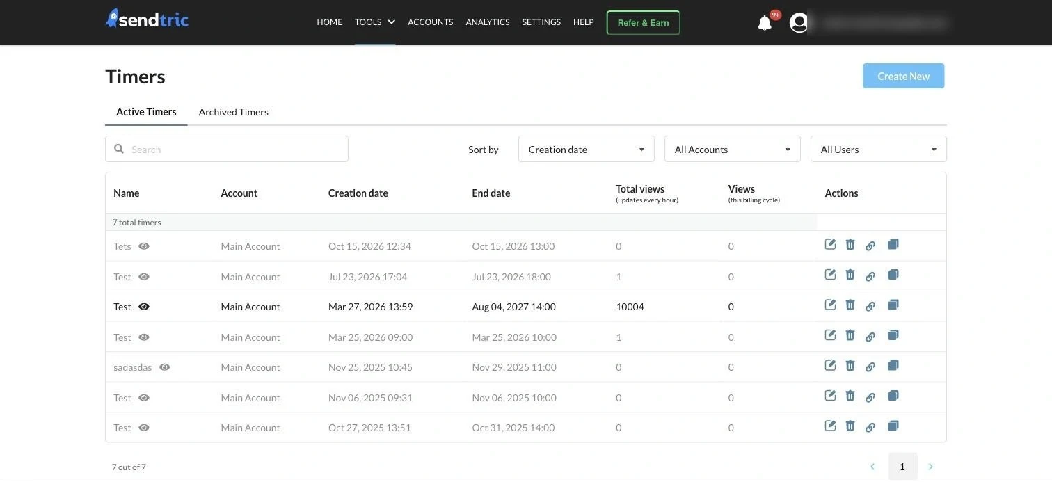
Dated tables showed status only as grey vs black text, icons had no labels and there were no bulk actions. The brief suggested cards.
Decision
A status-first list for each widget type: status chip, end date, a mini render and bulk archive. Cards stay one toggle away.
Why Timers are judged by date and status, and most people have 1–5 of them, so scanning beats browsing.
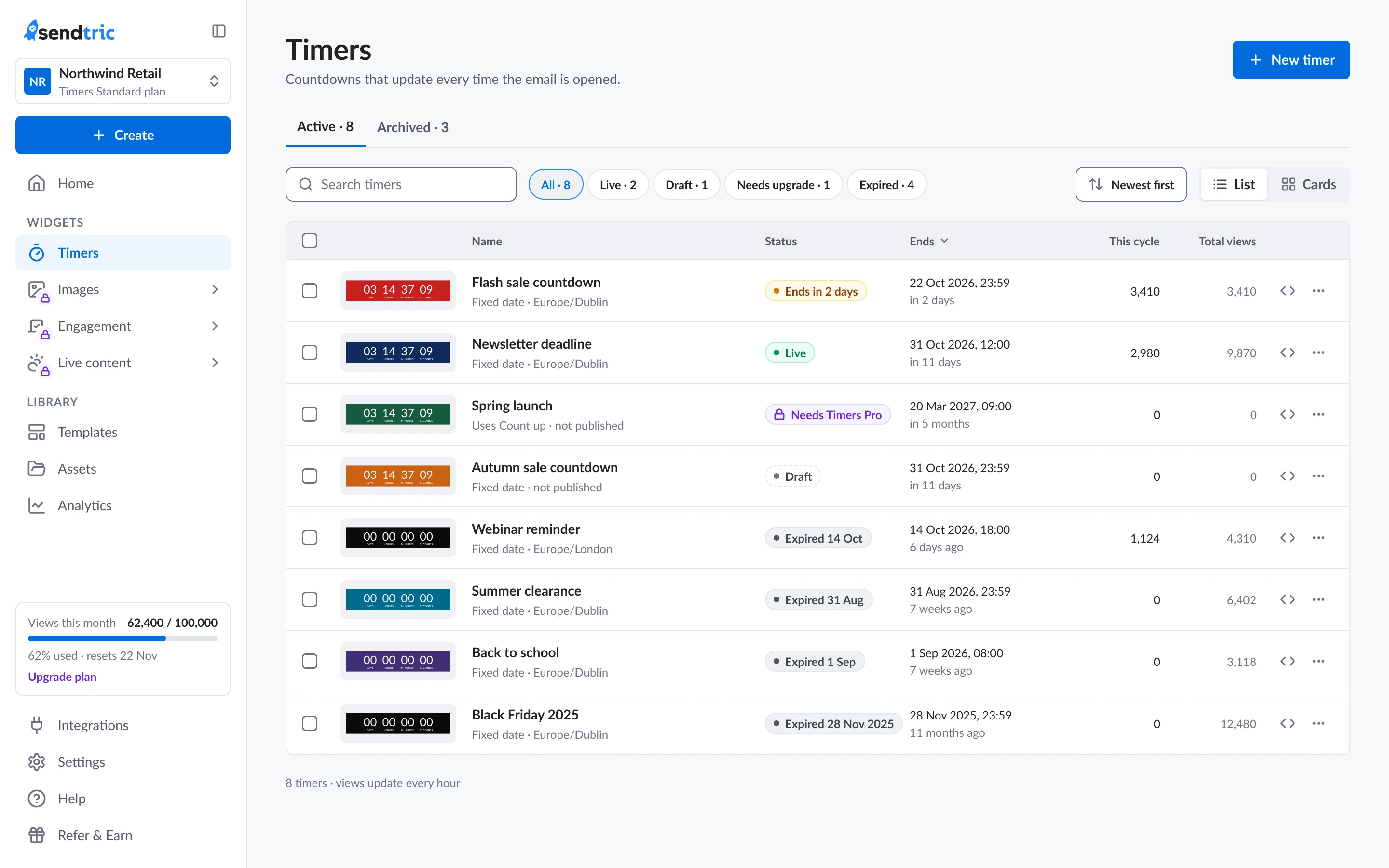
- 1 Status filters with counts, and newest first
- 2 Status chip on every row, “Ends in 2 days”, Live, Draft
- 3 Cards stay a toggle away, for image tools
04 Solves 01 · Navigation
A sidebar that scales by grouping.
Problem
Eight tools sat in one hover menu, two clicks deep, with no room for the tools coming next, while Timers took ~90% of use.
Decision
A sidebar with workspace and plan in view, Timers pinned, and the other tools grouped by job.
Why The tool people use most is one click away, and a new tool joins a group instead of forcing another redesign.
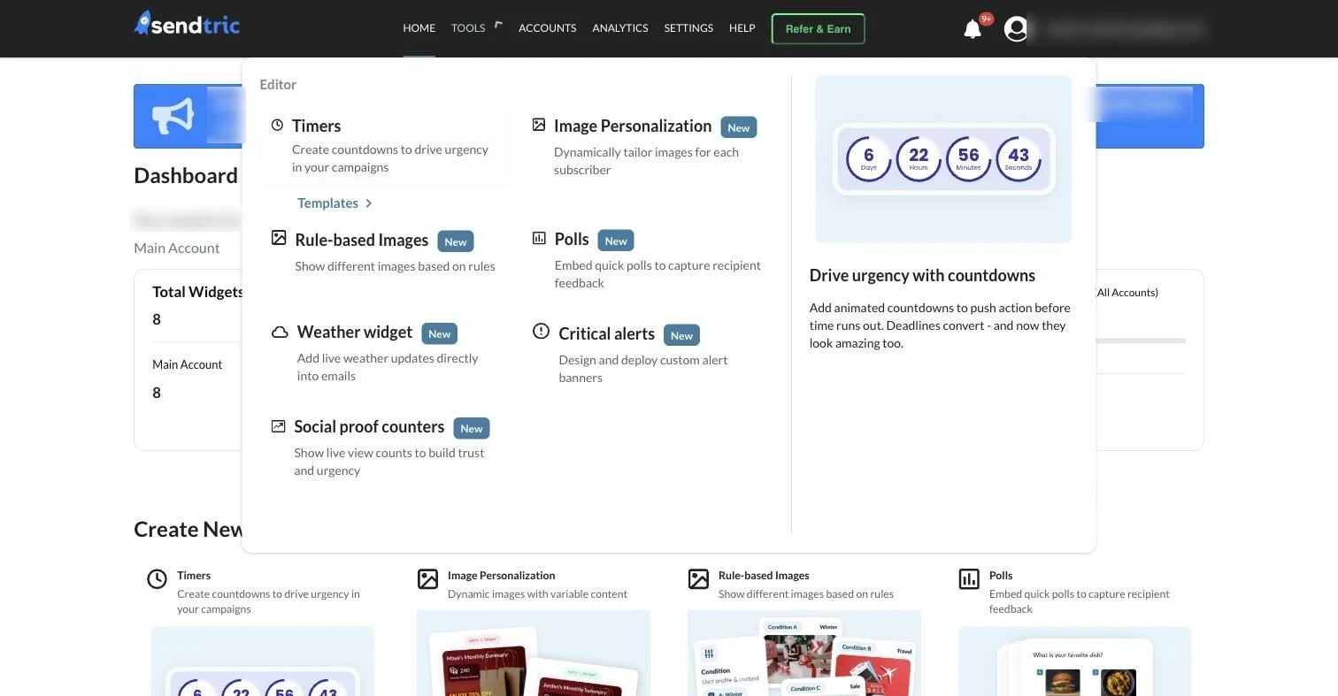
- 1 Workspace + plan, always in view
- 2 Tools grouped by job, Timers pinned first
- 3 Usage this cycle, with the upgrade next to it
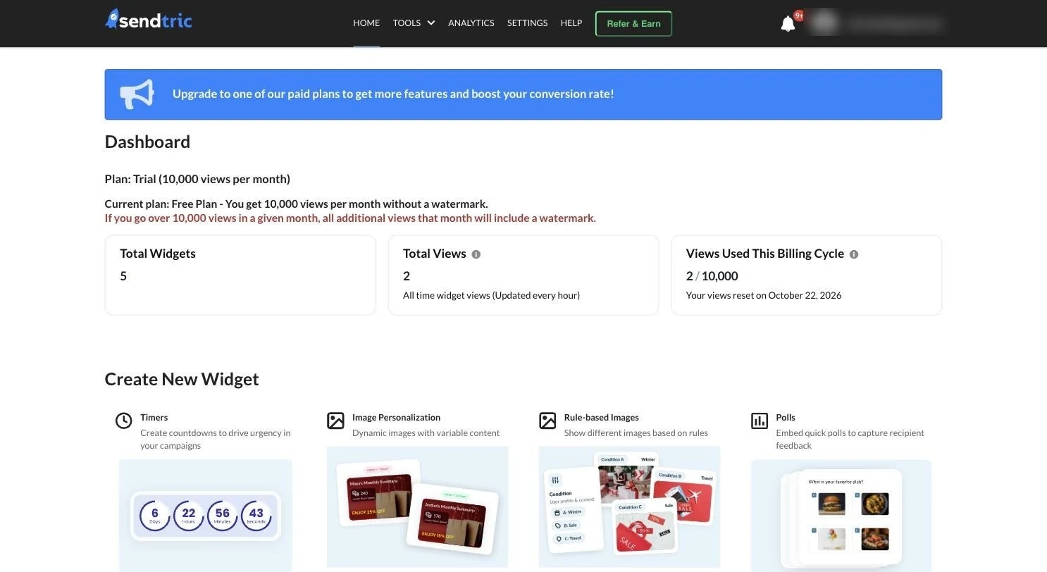
05 Solves 02 · Dashboard
A Home built only from data the product has.
Problem
The dashboard repeated the tools menu and didn’t say what needs attention; most visits passed straight on to the Timers list.
Decision
A Home built only from data the backend has: usage this cycle, live and draft counts, and create with real previews, in the structure the PO set.
Why A summary of real states is worth stopping on. Invented blocks would look good in a mockup and break trust in the product.
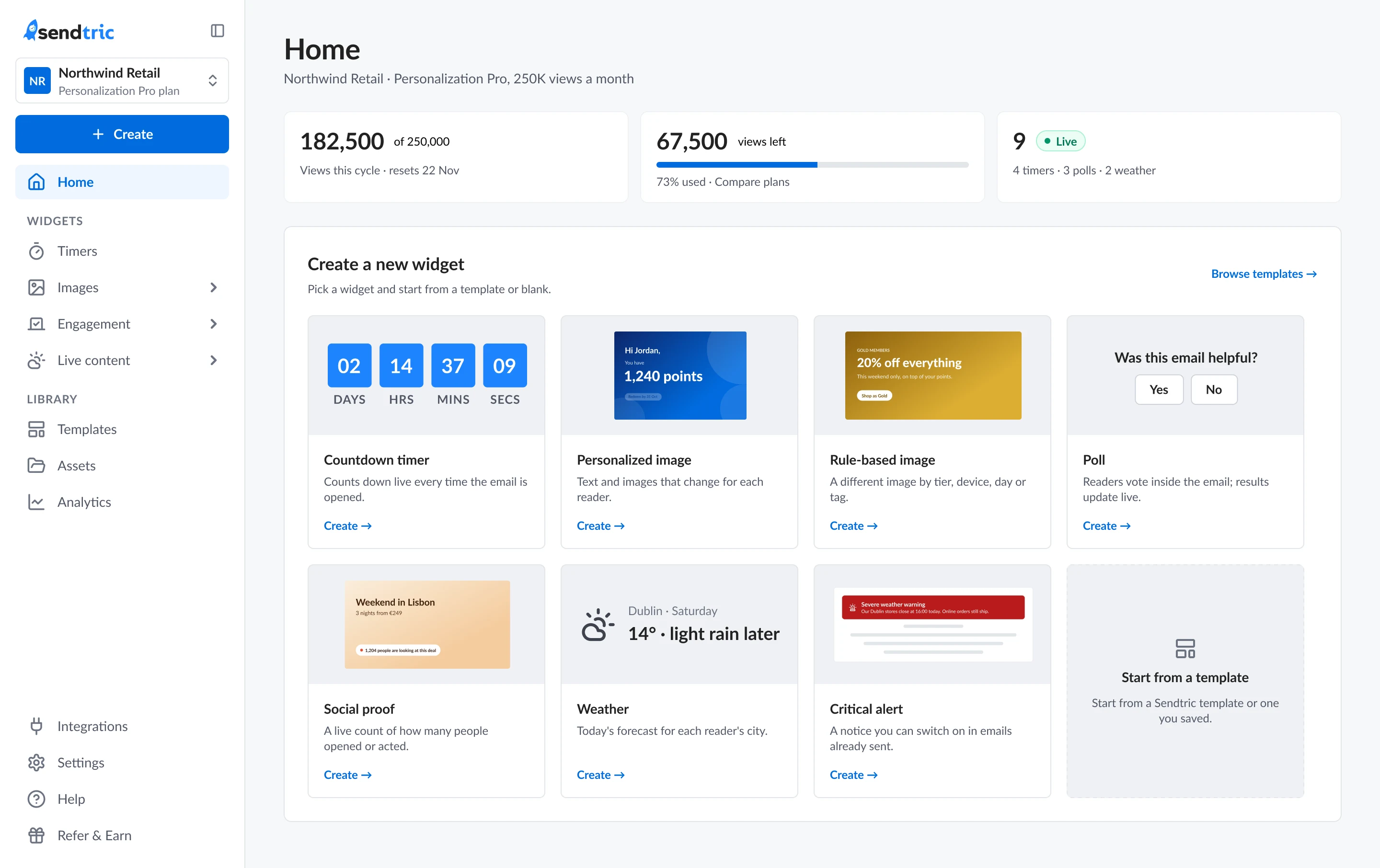
- 1 Usage this cycle, and what’s left
- 2 Live and draft counts, by widget type
- 3 Create with real previews, not a list of links
One source, from token to code.
Built with Claude Code Figma MCP
-
1
Primitives
-
2
Semantic
-
action/primary -
status/gate -
bg/canvas
-
-
3
Components
- Publish
- 🔒 Micro
- Live
- Draft
-
4
Code
-
--action-primary: #006cdd; -
--status-gate: #6d28d9; -
tailwind.preset.js
-
Plan gate as a property feature · widget · watermark. New pricing on 27 Oct: the file moved in a day; postponed on 9 Nov: moved back. 0 new components.
I designed the operating system, then directed the agent through it.
A design system is architecture, and Figma is one layer of it. The documentation lives where the agents read it at the start of every session.
Direction
Me · the only designer
brief, review stop after every phase, the calls only I can make
Agent
Claude Code
one agent, many connectors
Read + write
Figma
design file, components, variables
Read-only key
PostHog analytics
21 queries, observation vs. hypothesis
Read-only
Browser
audit of the live app; I do every login
References
Mobbin
pattern references, kept apart from evidence
Operating system
- Context file
- Decisions log · 200+
- Phase plan
- Safety rules
- Handoff format
- Learned rules
Delivered
Outputs
~170 screens · ~40 component sets · tokens → CSS + Tailwind · 17 code prototypes · 196-row parity map
Build
Product owner + his AI
built it from my handoff notes, no Dev Mode, no paid seat
- I direct and review Claude Code, with a review stop after every phase.
- Claude Code reads and writes the Figma file, reads PostHog through a read-only key, reads the live app in a browser where I do every login, and reads pattern references from Mobbin.
- Claude Code reads the operating system — the context file, the decisions log, the phase plan, the safety rules, the handoff format and the learned rules — at the start of every session.
- The operating system produces the outputs: about 170 screens, about 40 component sets, tokens as CSS and Tailwind, 17 code prototypes and a 196-row parity map.
- Those outputs hand off to the product owner, who builds the product with his own AI.
Redesigned and released in about 4 weeks.
Together with the product owner and an AI agent: about three weeks of design, then a week for the product owner to build it with AI while I finished the last phases. Released on 11 November.
-
~4 weeks
from the audit to release
-
~170
screens designed, light and dark
-
5 → 1
editor layouts became one shell
| How it changed | Before (baseline) | After |
|---|---|---|
| Saved → code copied or published | 71% | Measuring after launch |
| Paid timer-type picks ending in an error | 40% | No gate at Create, by design |
| Upgrades started inside the editor | < 1 in 10 | Measuring after launch |
| Rage clicks on the time picker | #1 control | Measuring after launch |
“It really is nice to work with someone who has an eye on detail for making things easy for the user to use, takes an analytical approach using the data, makes things look good, and takes into account the wider business context. Very few designers I’ve worked with do all of these.”