Tano Solo founder · iOS app
I wanted an app that knows the Korean I already know. To build it, I became the product team I didn’t have.
- Role
- Founder · product designer & PM
- Team
- Me, Claude Code and ~20 beta testers
- Platform
- iOS · fully offline · EN / UK
- Timeline
- 32 days, idea → App Store
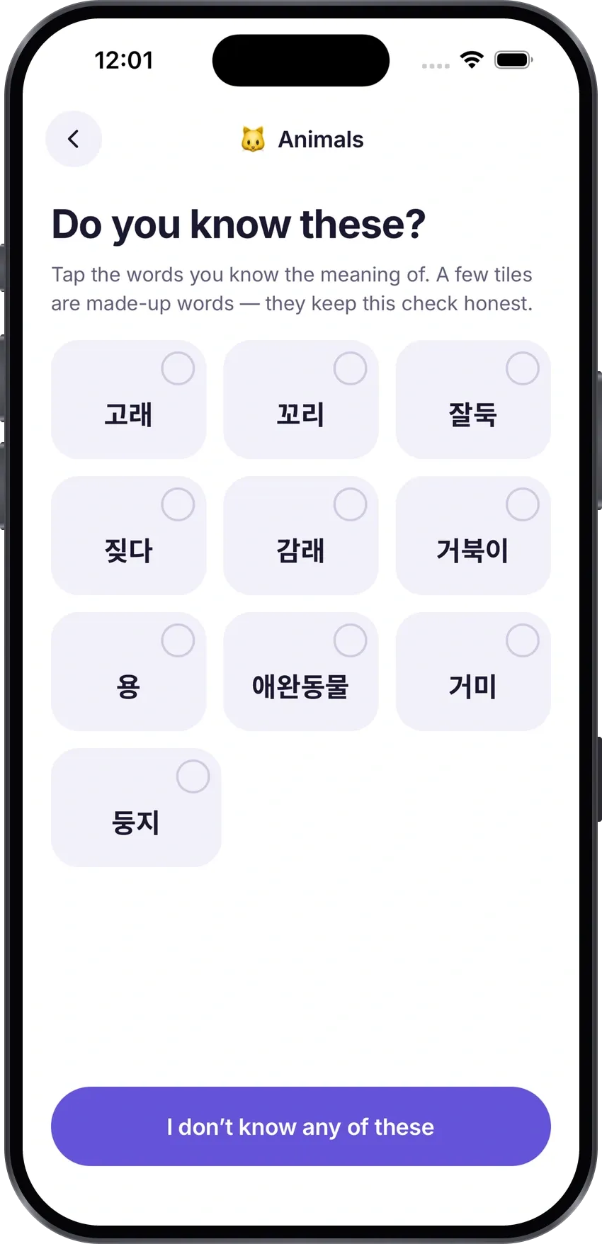
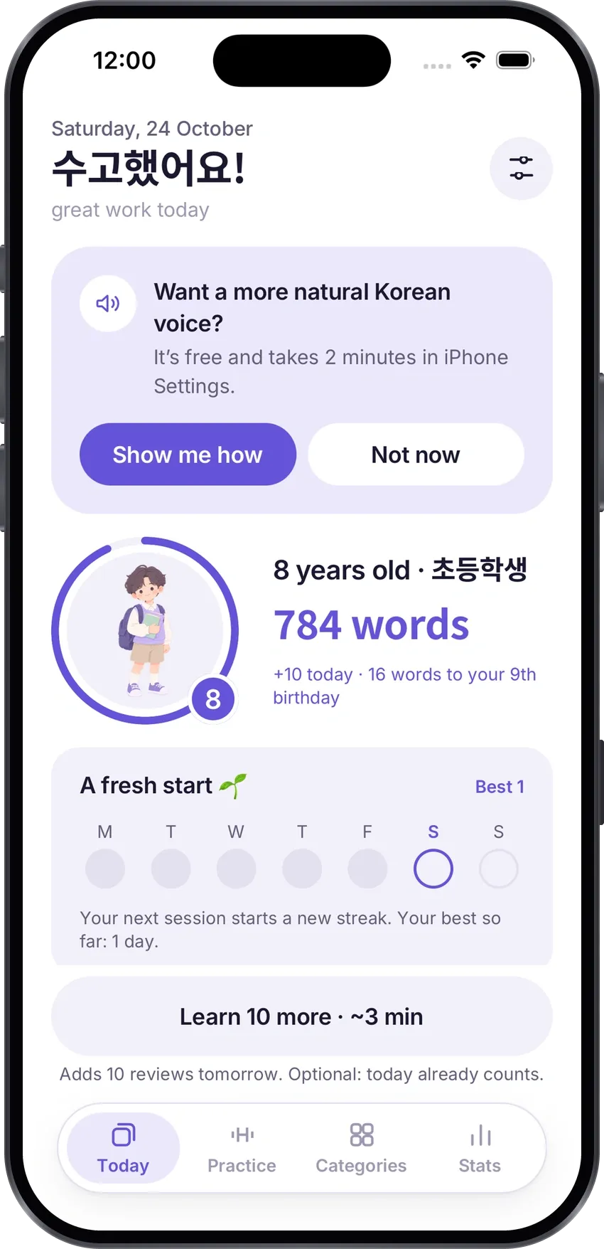
Every app made me start from “hello” again.
I’ve been learning Korean since school. When a BTS concert brought my motivation back, I found plenty of tools for grammar — and nothing for vocabulary that I wanted to open every day.
-
01 · What I kept running into
Too much game
Points, leagues and mascots pull attention away from the words themselves.
-
02 · What I kept running into
Words I already knew
Most apps start from zero, so after years of study you tap through “hello” and “thank you” again.
-
03 · What I kept running into
Lists I had to type in
Anki is powerful but comes empty: hours of deck-building before you learn a single word.
The promise
Korean words for real topics and situations — without the ones you already know.
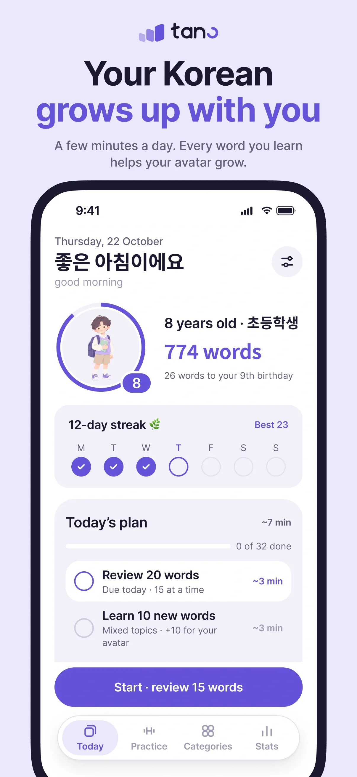
- Knows what I already know from the first minute
- Gives words for real topics, not random cards
- Decides by itself when it’s time to review
- Motivates without guilt — no “you lost your streak”
Who I designed for
-
Coming back
Studied once, remember some of it, refuse to start over. Needs an accurate level check.
-
Beginners who read Hangul
Need a calm pace and no overload in the first days.
-
K-pop & K-drama fans
Emotional motivation, so progress reads in real terms: “I can order a coffee now”.
-
Ukrainian speakers
Almost no Korean apps speak Ukrainian. It was built in from day one, not “someday”.
From idea to App Review in 32 days.
I split the work into phases, and every phase ended with my own test on a real iPhone. Only after my “approved” did the next one start.
The 33 days in words
Thirty-three days, 27 Sep to 29 Oct 2026, across five tracks.
- Build: Core app & data, 27 Sep – 2 Oct; UK, 4 Oct. Level check, reviews, Today, paywall, the Tano name. Ukrainian: foundation → shipped in one day (4 Oct). Practice · new stats · streaks shipped (21 Oct).
- Beta: Public TestFlight beta · Telegram group · a flag on every word, 7 Oct – 24 Oct.
- Design: 7 design rounds for Practice, 12 Oct – 20 Oct.
- Ship: Purchases, 22 Oct – 23 Oct; QA, 24 Oct; Feature freeze, 28 Oct; Submitted to App Review, 29 Oct. Freeze → submit.
- TestFlight: build 2 on 3 Oct, build 3 on 4 Oct, build 5 on 8 Oct, build 6·7 on 21 Oct, build 8 on 24 Oct, build 9 on 28 Oct.
- Milestones: Research + first 13 decisions on 27 Sep, First TestFlight build on 3 Oct, Public beta · ~20 testers on 7 Oct, Decisions D29–D41 approved on 21 Oct, Feature freeze on 28 Oct, Submitted to App Review on 29 Oct.
- Build 9 went to the App Store.
Three questions before I drew a screen
Tano promises to skip the words you already know. To keep that promise honestly, I needed answers to three questions.
-
Question 1
What do learners miss in other apps?
Session complete
Today’s words
- 사과 apple
- 고양이 cat
- 학교 school
In 10 apps, learned words sit in one long list. What people valued most was the list at the end of a session — when one app removed it, learners asked for it back for two years.
So in Tano
Every session ends with that day’s words, and each one plays and opens
-
Question 2
How can a short test measure thousands of words?
easy rare
벙타 fake
a made-up word catches guessing
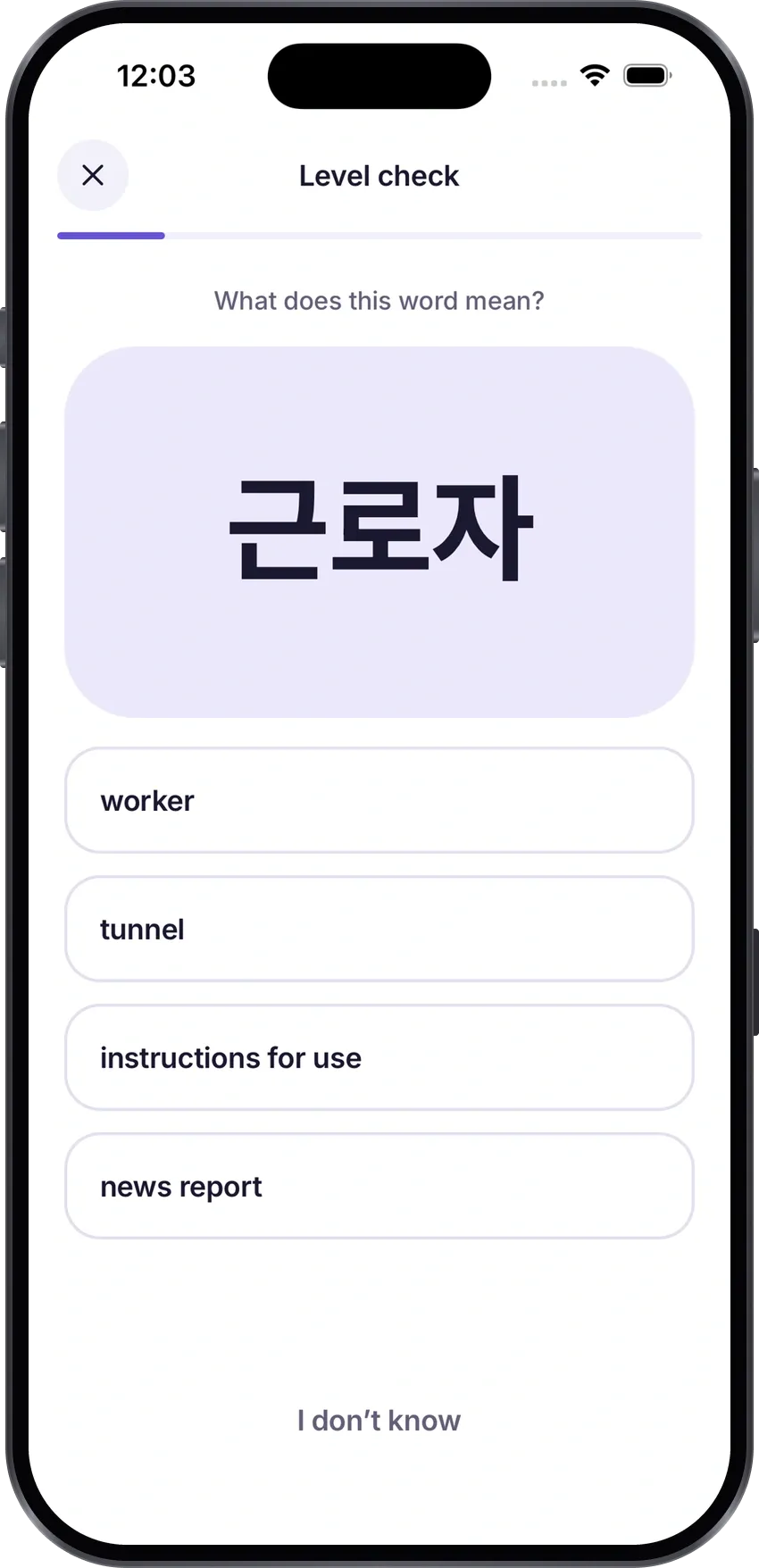
Vocabulary research: ask a few words from each level of difficulty, pick each next word from your answers, and mix in made-up words to catch guessing.
So in Tano
A level check that adapts to every answer, with a few fake words and an honest “I don’t know”
-
Question 3
How short can that test be — and still place you right?
26% wrong
20 questions
31% wrong
12 questions
after a month of use: 8–10% for both
I tested it on 1,500 simulated learners first. 12 questions misplace you almost as rarely as 20, and a month of use fixes the rest.
So in Tano
At most 12 questions instead of 20
88%
The same simulation caught a mistake: 88% of advanced learners were placed a level too low. I fixed the model before any real person took the test.
One loop, repeated 14 times
I’m a product designer, not a developer. An AI agent, Claude Code, wrote the code. Deciding what to build, in what order and when it’s done was on me. Every phase went around the same loop.
14× once per phase,
from research to launch
- 1 · I decide what’s next on the board, by impact and risk
To do
- 2 · Claude Code builds it code, data, automated checks
In progress
- 3 · I test it on my iPhone what to tap, what I should see
Testing Done
- 4 · Beta testers try it ~20 people on TestFlight, from 7 Oct
Backlog new cards from their feedback
- 5 · I write the decision down a numbered entry with a reason
Waiting on Iryna
-
14
phases, each closed by a phone test
-
41
decisions written down
-
115
tasks on one board, 59 done
-
4
documents the AI reads first
41 decisions. Five of them shaped the product.
Every decision is written down with its reason. These five changed what Tano is — and four of them came from the people testing it.
-
1 · My assumptions
A first version from my own idea
Flashcards with answer options, word categories and a stats dashboard. Built on my assumptions about how people learn.
-
 Advanced
 Beginners
2 · Not launched yet
I found testers first
Before the App Store, I gathered testers at both ends: advanced learners who study Korean professionally or live in Korea, and beginners.
-
3 · The right call
Their feedback shaped the product
Round after round, testers changed what Tano is. The decisions below came out of it.
- No romanization
- A Practice tab
- Fill in & Write exercises
- 01 Level check
- 02 No romanization
- 03 Practice
- 04 Exercise ladder
- 05 The business model
Decision 01
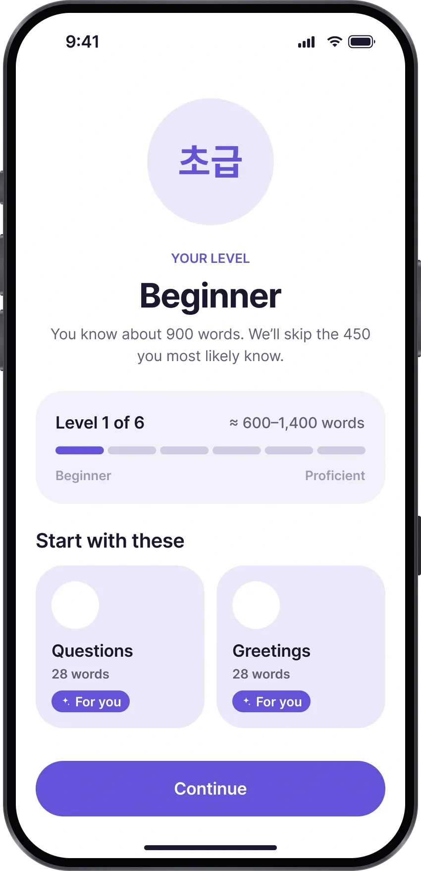
The level check: shorter, but honest.
Problem 15–20 questions with an “n / 20” counter felt like an exam.
Decision an adaptive test, at most 12 questions, that stops once the level is clear.
-
12
questions, median 11
-
80–82%
of beginners stop early, after 4 misses
-
0.4%
of people with 400+ words stopped too early
Decision 02 · from beta testers
No romanization: eyes on Hangul.
Problem romanization under every word. Testers agreed: Latin letters pull the eye away from Hangul.
Decision romanization off everywhere; pronunciation in Hangul only where it differs.
-
Day 1
of the public beta
-
1,649
cards with pronunciation in Hangul
-
1 switch
brings it back if ever needed
The trade-off
Harder for people who can’t read Hangul yet, so the app says so up front.
The first version
식물
sikmul
plant
The eye reads Latin letters, not Hangul
Now
식물 [싱물]
plant
Pronunciation in Hangul, only where it differs
Decision 03 · from beta testers
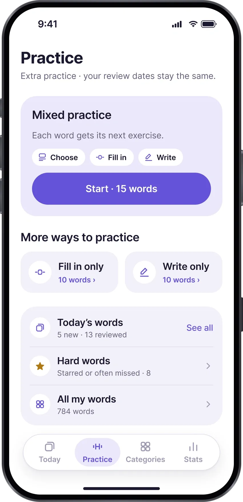
Practice: the tab testers asked for.
Problem the first version had no practice, only new words and reviews. Testers asked for it.
Decision a Practice tab, right after Today, after seven design rounds.
-
7 rounds
of design in 9 days
-
10 of 12
testers called it most useful
-
0
review dates it changes
Testers asked
“I want to see the words I learned today”
“Let me fill words into sentences”
“I want to practise one topic”
…became the Practice tab
Decision 04
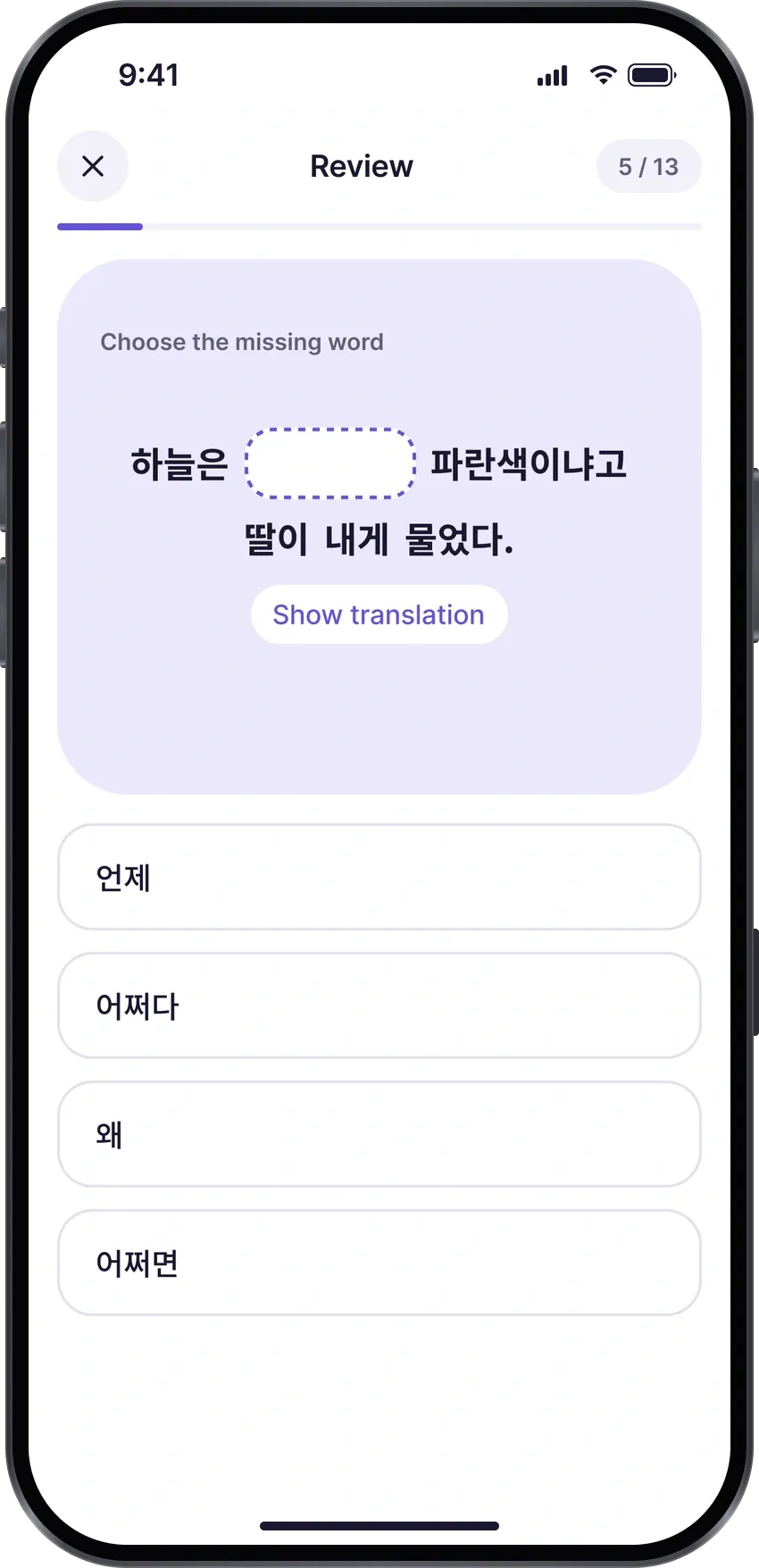
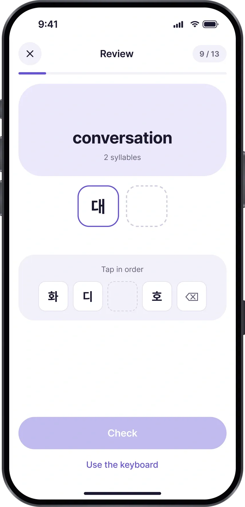
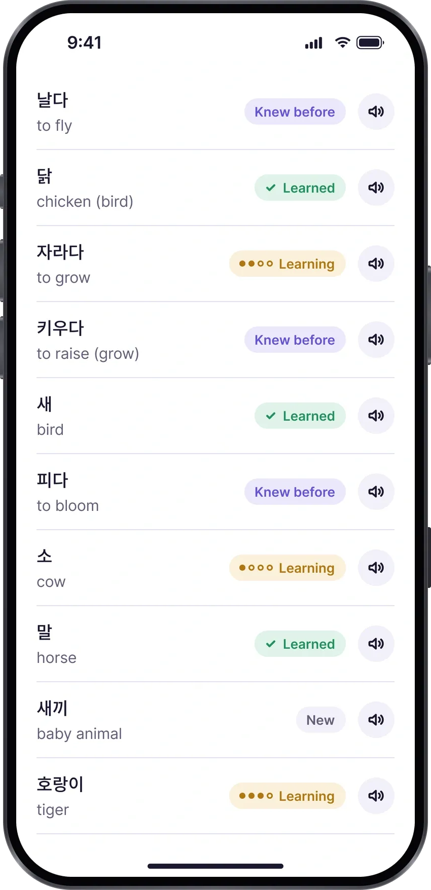
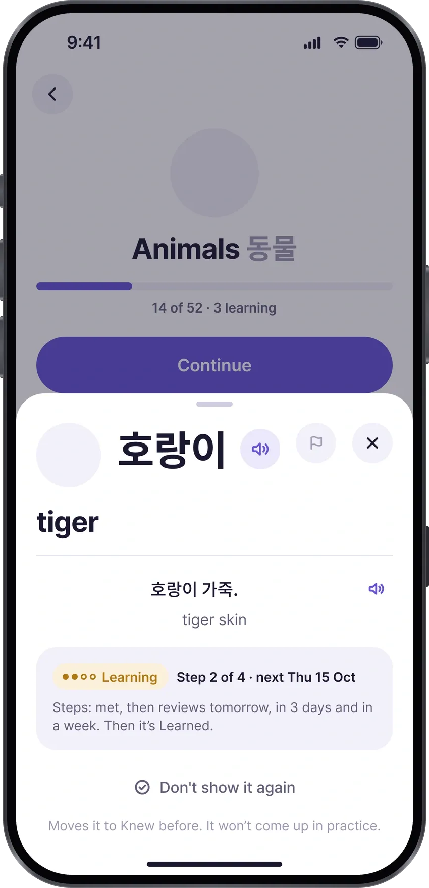
Each dot on a word’s path is earned with a harder exercise.
Problem multiple choice only checks that you recognise a word.
Decision every review step asks for a harder exercise, up to writing the word.
-
Day 0 · Met the word
Choose the meaning
-
Day 1 · Review tomorrow
Choose the Korean word
-
Day 3 · In 3 days
Fill it into a sentence
-
Learned
Day 7 · In a week
Write it from Hangul tiles
A mistake moves the word one step back.
Decision 05
The business model: lock the extras, never the study.
Problem most apps lock core study behind a paywall, and learners hate it.
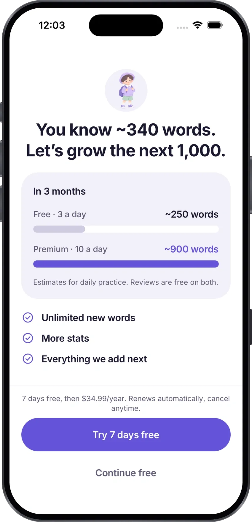
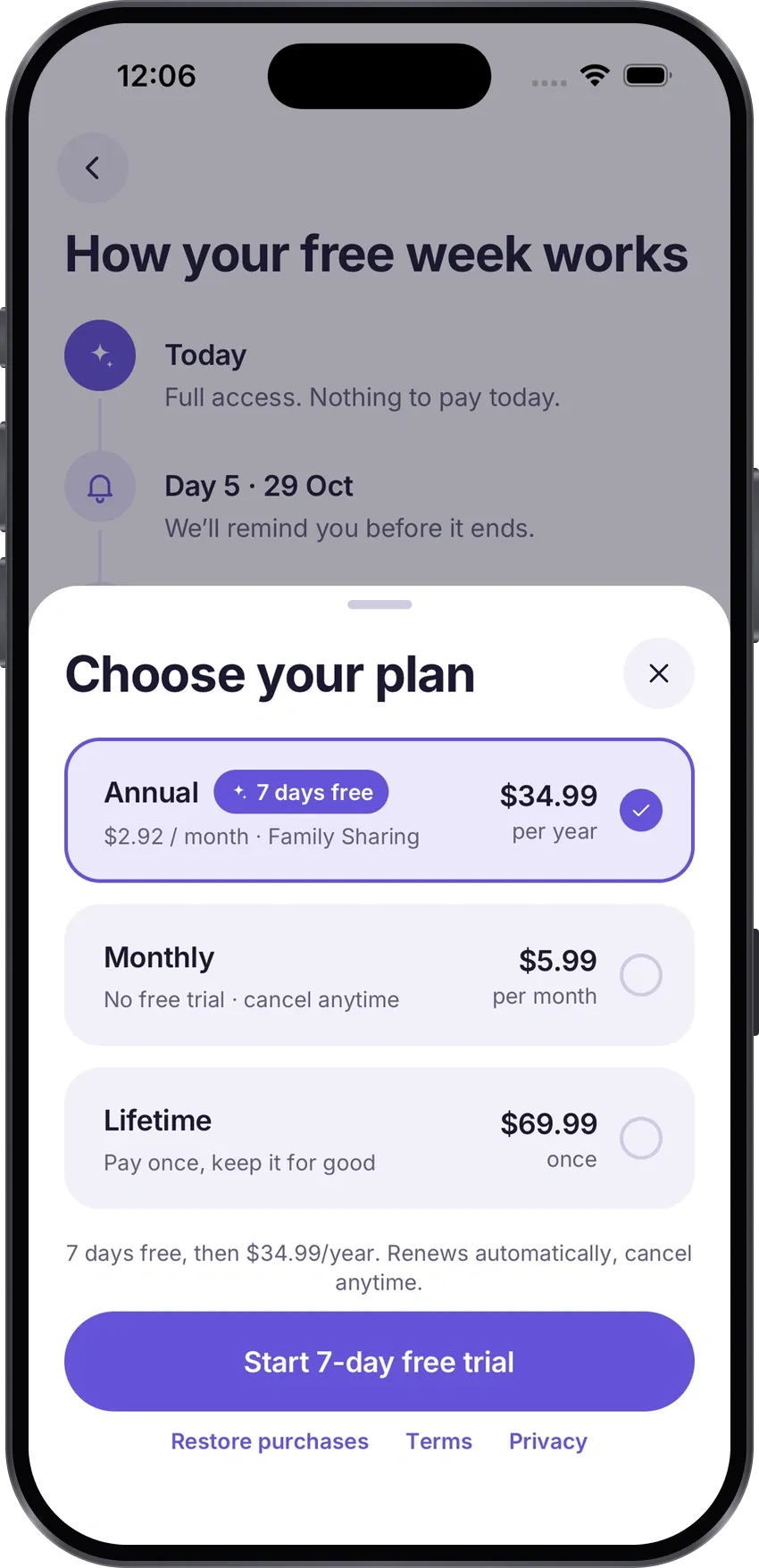
Decision every review free forever; Premium adds speed and harder exercises, and appears only after the learner feels the value.
-
$5.99
a month
-
$34.99
a year, 7 days free, Family Sharing
-
$69.99
once, for life
Ukraine priced by hand: $2.99 · ~$24.99 · $39.99.
Before launch, I asked the testers one last time.
A week after the first line of code, Tano was in real people’s hands. Their two biggest changes, no romanization and Practice, are in the decisions above. Right before the App Store, I sent the testers a final feedback form.
The final feedback form
12 testers answered on the last beta build, 23–30 October 2026. A small sample, but four strong signals:
-
7 of 12
would be very disappointed if Tano disappeared. The usual product–market fit bar is 40%; here it’s 58%
-
10 of 12
named Practice among the most useful parts: the tab that didn’t exist in the first version
-
10 of 12
said the level check placed them about right
-
8.0 / 10
average answer to “How likely are you to recommend Tano to a friend learning Korean?”
AI gave me a team’s speed. The judgement stayed with me.
Claude Code wrote the code, the data and the automated checks. It didn’t know what matters to a learner, what to postpone or what to cut. That part stayed with me.
Me founder, designer, PM
-
Decide
what to build next, what to cut, the launch date
-
Ask the questions
what research should answer, and which answer to trust
-
Design
UX, UI and copy in Figma, in both languages
-
Test every build
on my iPhone: the only one who can say “Done”
-
Talk to testers
the chat, the polls, the final form
-
Run the business
App Store, pricing, legal, marketing
What I hand to Claude Code:
- decisions
- designs in Figma
- notes from the phone test
Nothing ships without my “Done”
What Claude Code hands back:
- a build to test
- “here’s how to check it”
- research digests
Claude Code AI agent, in the terminal
-
Write the code
~26,700 lines of TypeScript
-
Build the word data
a Python pipeline for 5,671 cards
-
Check its own work
21 automated checks before every handover
-
Research digests
sources, how other apps do it, a recommendation
-
Keep everything in sync
“Built in code” pages in Figma, the Notion board
-
The Ukrainian version
~85 agent runs, up to 16 at a time
A brand that grows up with you.
Most language apps bring you back with points, gems and guilt. I wanted Tano to feel calm and warm instead, built on one idea: your Korean grows up. The avatar makes that idea visible, and the logo, the colours and every line of copy follow it.
The character
An avatar that grows up, instead of points and gems.
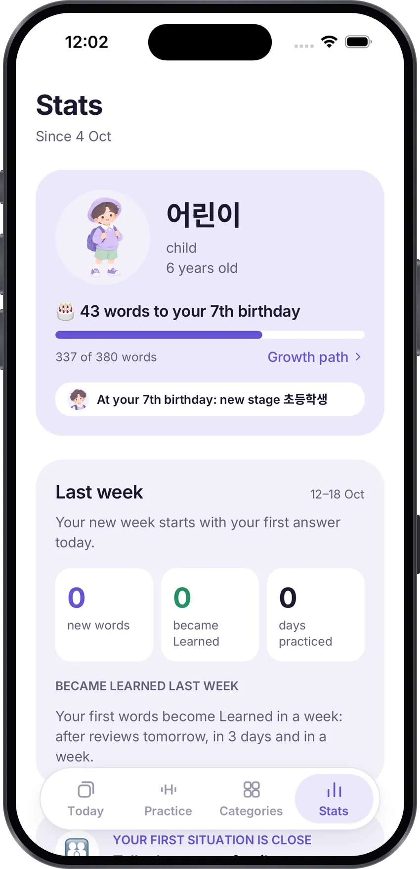
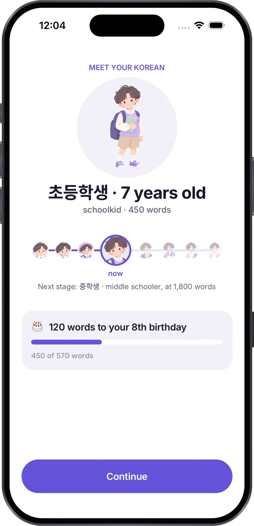
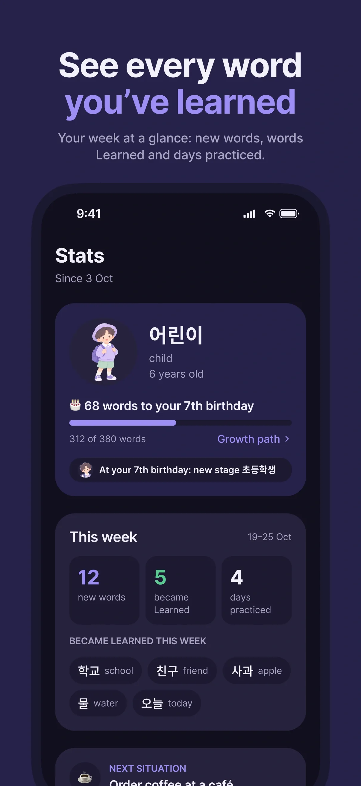
My own idea to make Tano stand out and bring people back. A character ages with the words you know, learn or have on the way: 8 stages from 아기 (baby) to 어른 (adult), and a birthday for every new year. You come back to see who your Korean becomes, not to protect a score.
-

1 · 아기
-

2
-

3
-

4
-

5
-

6
-

7
-

8 · 어른
The mark and the name
The working name was 단어장 (“vocabulary notebook”); on 2 October it became Tano. A “turning card” mark and a wordmark with a ring for the “o”. The icon is made in Apple’s Icon Composer, so iOS draws it in four looks.
-

Default
-

Dark
-

Clear
-

Tinted
Colours and type
One calm accent for everything you tap, soft lavender for cards, and a deep ink instead of black. Every colour is a token, so dark mode is the same system, not a second design.
-
#6553D8
accent
-
#ECE8FC
accent soft
-
#1B1830
text
-
#F2F0FA
surface muted
-
#110F1E
dark canvas
-
#9D8FF5
dark accent
식물 plant
식물 plant
- Aa Inter the interface
- 한글 Noto Sans KR Hangul, always first
Every screen, checked in 8 modes
2 languages × light and dark × default and largest text — on iPhones from the SE (375 pt) to the widest. Plus VoiceOver and Reduce Motion.
-
Aa
EN · light · default
-
Aa+
EN · light · largest
-
Aa
EN · dark · default
-
Aa+
EN · dark · largest
-
Aa
UK · light · default
-
Aa+
UK · light · largest
-
Aa
UK · dark · default
-
Aa+
UK · dark · largest
Launching on the App Store is a product of its own.
Money, legal, the storefront, Apple’s review, marketing. I did all of it myself, step by step, while Claude prepared the code, the copy and the instructions.
Tano: Korean Flashcards
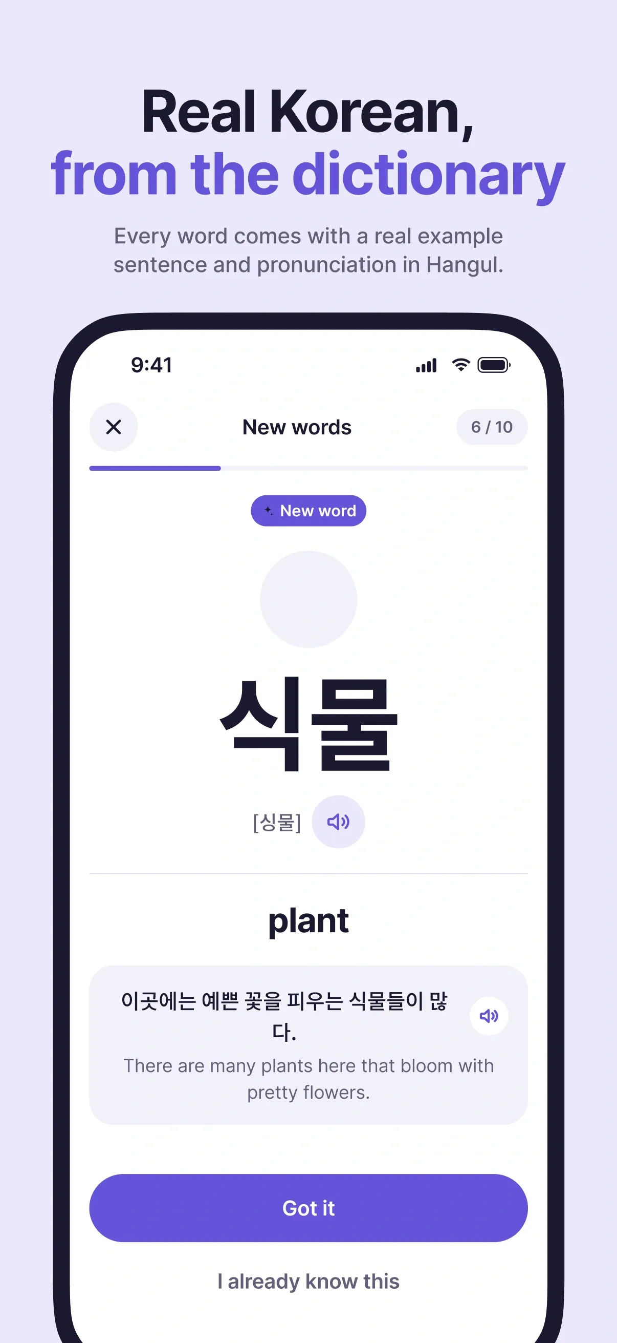
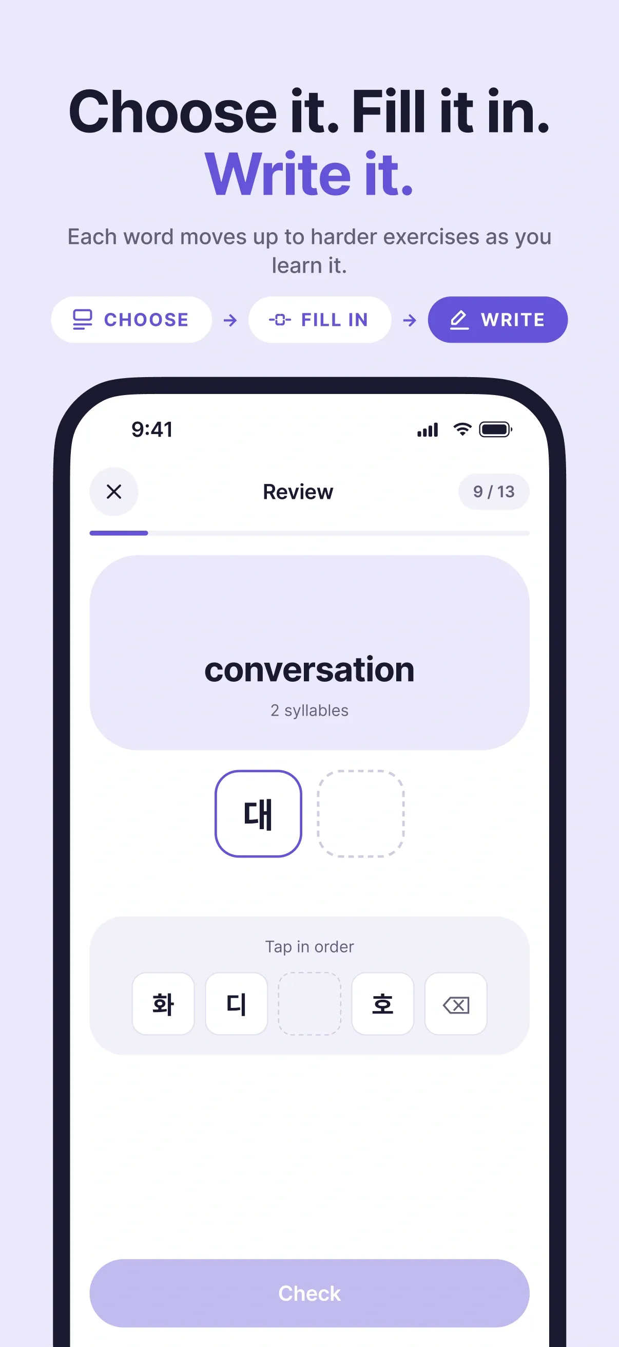
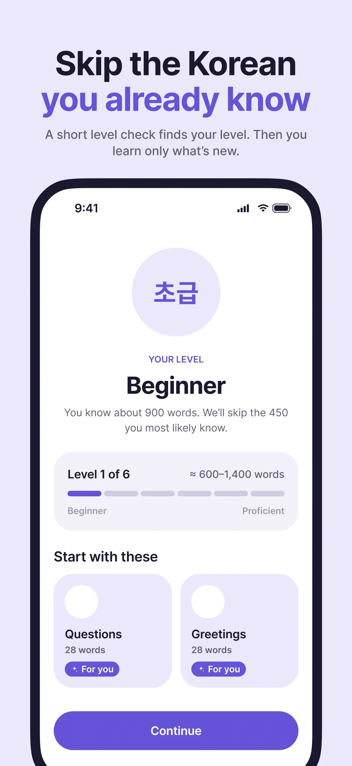
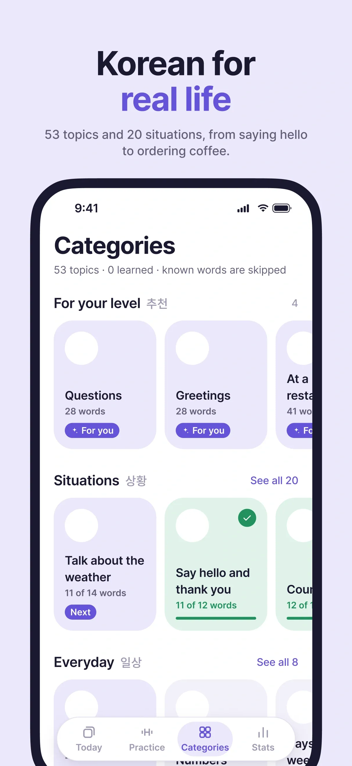
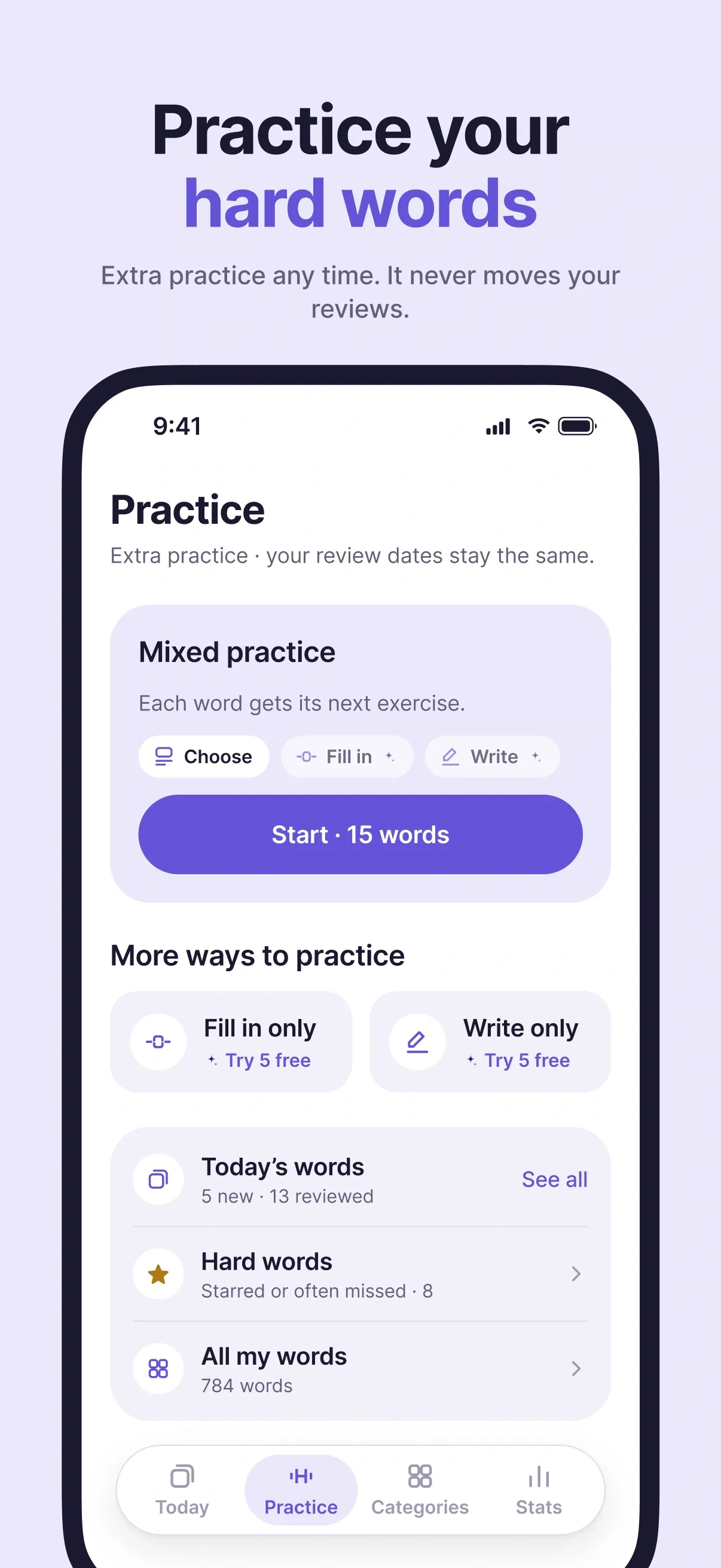
The App Store page · 7 screenshots, one message each, in English and Ukrainian
- EN
- UK
- Style A, of 2 directions
The website
tanokorean.com
“Your Korean grows up with you”
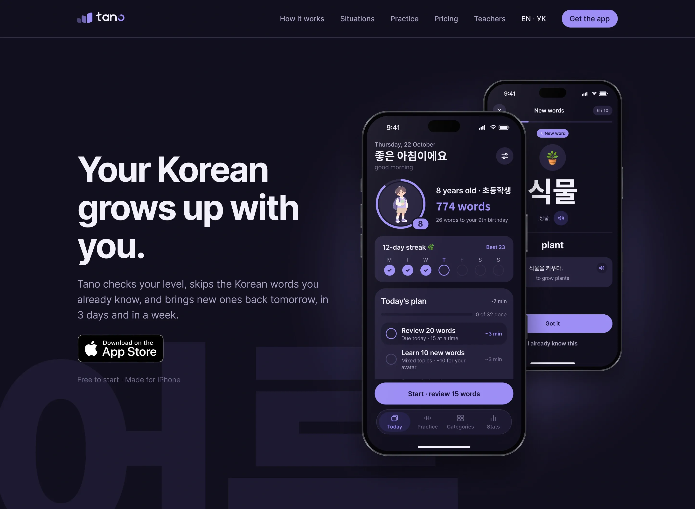
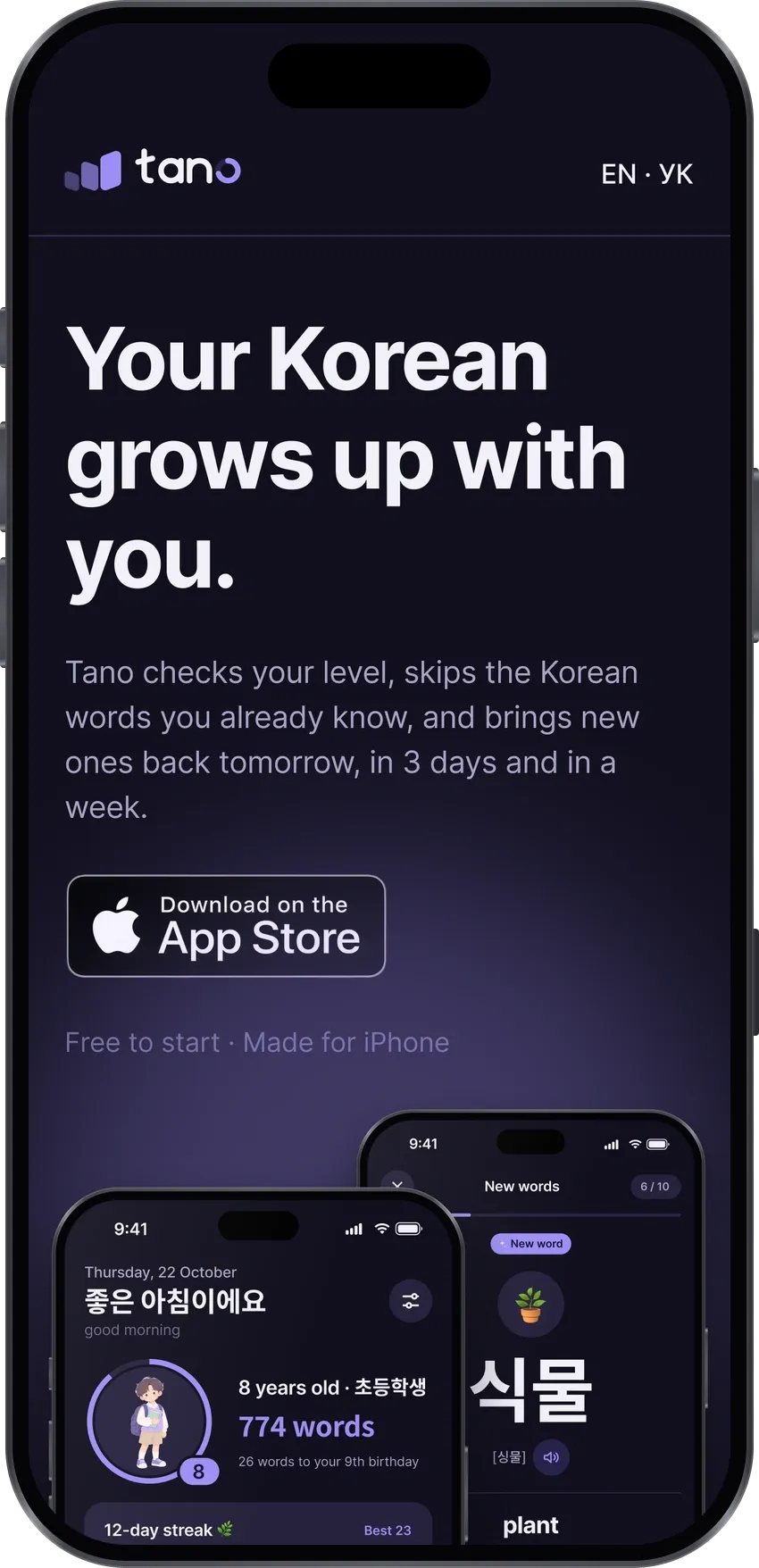
Four phases, each approved on its own: research on 23 sites, the structure and two visual directions, a design for desktop and mobile, then a site built with Astro, in English and Ukrainian.
- EN + UK
- Desktop 1440 · Mobile 390
- Privacy, support, teachers
It looks simple. Underneath is a small team’s worth of product.
Cards, a Start button, an avatar. Numbers as of 11 November 2026.
5,671
cards from the National Institute of Korean Language’s dictionary — 5,647 words and 24 phrases, each with an example and its sound
-
53
topics in 7 sections
-
20
real-life situations, café to job interview
-
2,952
fill-in exercises
-
304
made-up words, each checked in Korean dictionaries
-
6,024
Ukrainian translations, blind back-checked
-
1,649
cards with pronunciation in Hangul
What I’d keep, and what I’d do differently.
The thread through every decision
Honesty as a design principle. These constraints never slowed the work down — each time, they shortened the list of options.
What worked
-
The phone-test gate
The wall of 59 reviews, guessing on unseen words, text that moved too fast — I saw them only on a real iPhone.
-
The decision log
When a decision came back (the goal options, streaks from “never” to “with rest days”), I saw its whole history.
-
Measure, don’t guess
Simulations twice talked me out of the obvious review cap.
-
Feedback is a symptom
Before building what people asked for, I looked for why they asked.
-
A second priority on the board
The AI’s honest rating caught me falling for a feature, or putting off a boring, critical one.
What I’d do differently
-
A native speaker earlier
I turned the session down on 4 October; the experts started after the submission, so their fixes wait for 1.1.
-
Check high levels before the beta
That levels 5–6 lack words surfaced only after a tester’s complaint.
-
Live with the app longer myself
The default 6 seconds per card is still a calculation, not real data.
“I like that it’s focused on Korean specifically, which makes it unique on the Ukrainian market. With help and hints from people who are directly connected to the language, the app keeps getting better, and there are lots of ways to learn words.”